Building List & Detail Pages
This tutorial shows you how to build list and detail pages that match Headlamp's core UI. We'll achieve this by using the Headlamp CommonComponents ResourceListView for powerful, feature-rich list pages and DetailsGrid for comprehensive detail views.
Table of Contents
- Introduction
- Building a Pod List Page
- Understanding ResourceListView
- Building a Pod Detail Page
- Understanding DetailsGrid
- Adding Actions to Detail Page
- Navigation Between List and Detail
- Customizing Columns and Details
- Troubleshooting
- What's Next
- Quick Reference
Introduction
In Tutorial 5, you created a custom MyPod class and built a simple Pods page using a basic Material UI table. While that works, Headlamp provides powerful components that give you professional list and detail views with minimal code:
| Component | Purpose | Features |
|---|---|---|
ResourceListView | Display lists of Kubernetes resources | Sorting, filtering, pagination, row actions |
DetailsGrid | Display detailed information about a single resource | Automatic metadata display, extra info sections, event integration |
What You'll Build
By the end of this tutorial, you'll have:
- A professional Pod list page using
ResourceListViewwith:- Custom columns (Name, Namespace, Phase, Container Images, Age)
- Sorting, filtering, and clickable names linking to the detail page
- A Pod detail page using
DetailsGridwith:- Standard metadata display
- Custom info fields (Phase, Node, Pod IP)
- A custom Containers section using
SimpleTable - An "Evict Pod" action button in the header
- A back link to the list page
Prerequisites
Before starting, ensure you have:
- ✅ Completed Tutorial 5: Advanced Kubernetes Interactions
- ✅ Your
hello-headlampplugin with theMyPodclass from Tutorial 5 - ✅ Headlamp running with a connected cluster
Time to complete: ~30 minutes
Building a Pod List Page
Let's replace the simple table from Tutorial 5 with ResourceListView.
Step 1: Update Your Pod List Page
Open your src/index.tsx and update the MyPodsPage component:
import {
  registerRoute,
  registerSidebarEntry,
} from '@kinvolk/headlamp-plugin/lib';
import { ResourceListView } from '@kinvolk/headlamp-plugin/lib/CommonComponents';
import { MyPod } from './resources/pod';

function MyPodsPage() {
  return (
    <ResourceListView
      title="My Pods"
      resourceClass={MyPod}
      columns={[
        'name',
        'namespace',
        {
          id: 'containerImages',
          label: 'Container Images',
          getValue: (pod: MyPod) => pod.containerImages?.join(', ') || '-',
        },
        {
          id: 'age',
          label: 'Age',
          getValue: (pod: MyPod) => pod.age,
        },
      ]}
    />
  );
}

registerRoute({
  path: '/my-plugin/pods',
  sidebar: 'my-plugin-pods',
  component: MyPodsPage,
  exact: true,
});

registerSidebarEntry({
  parent: 'my-plugin',
  name: 'my-plugin-pods',
  label: 'Pods',
  url: '/my-plugin/pods',
});
What changed?
| Before (Tutorial 5) | After (Tutorial 6) |
|---|---|
Manual useList() hook | resourceClass prop handles it automatically |
| Manual loading/error states | Automatic handling |
Basic <Table> component | Full-featured ResourceListView |
| Manual pagination | Built-in pagination |
| No filtering | Automatic namespace filtering |
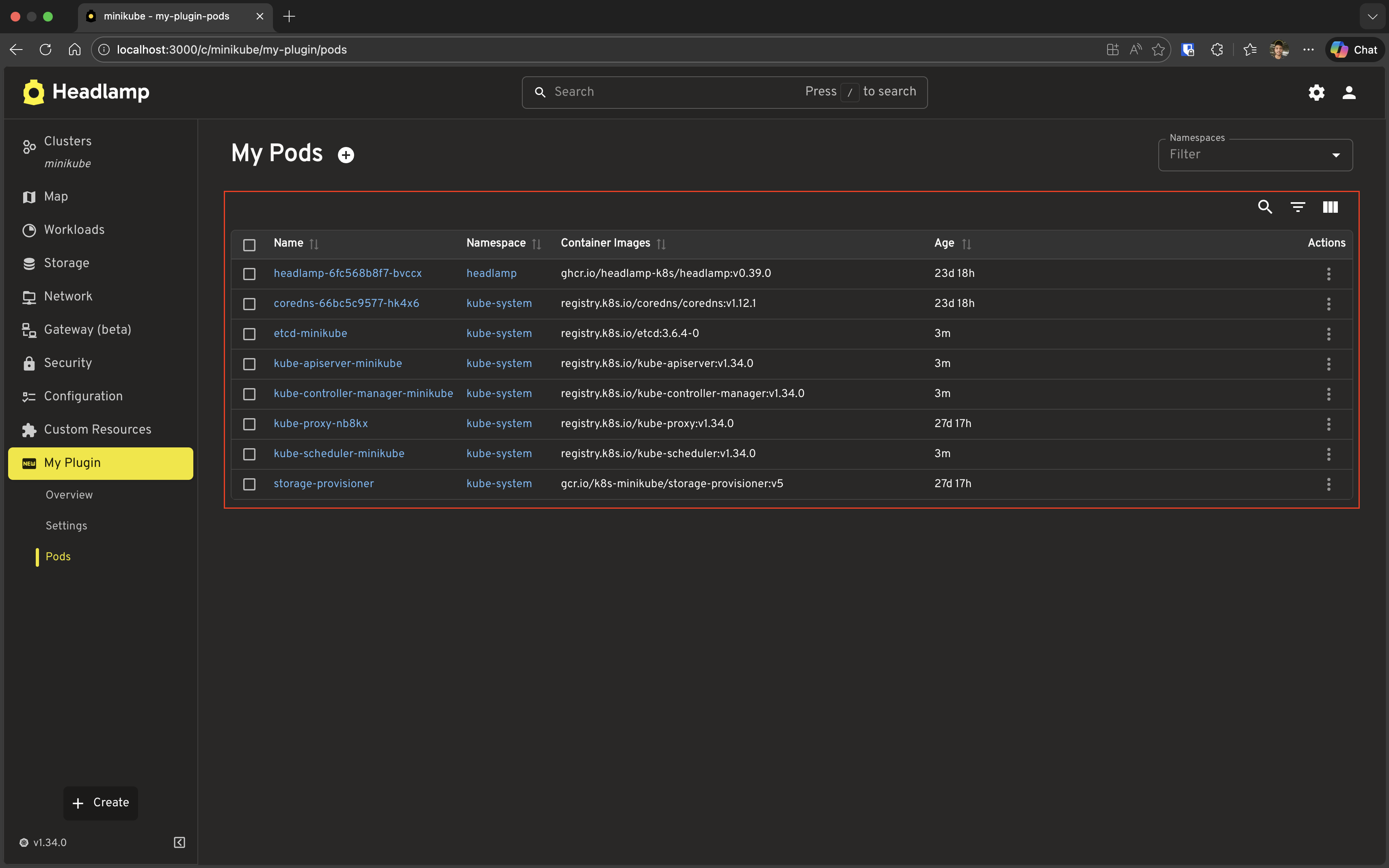
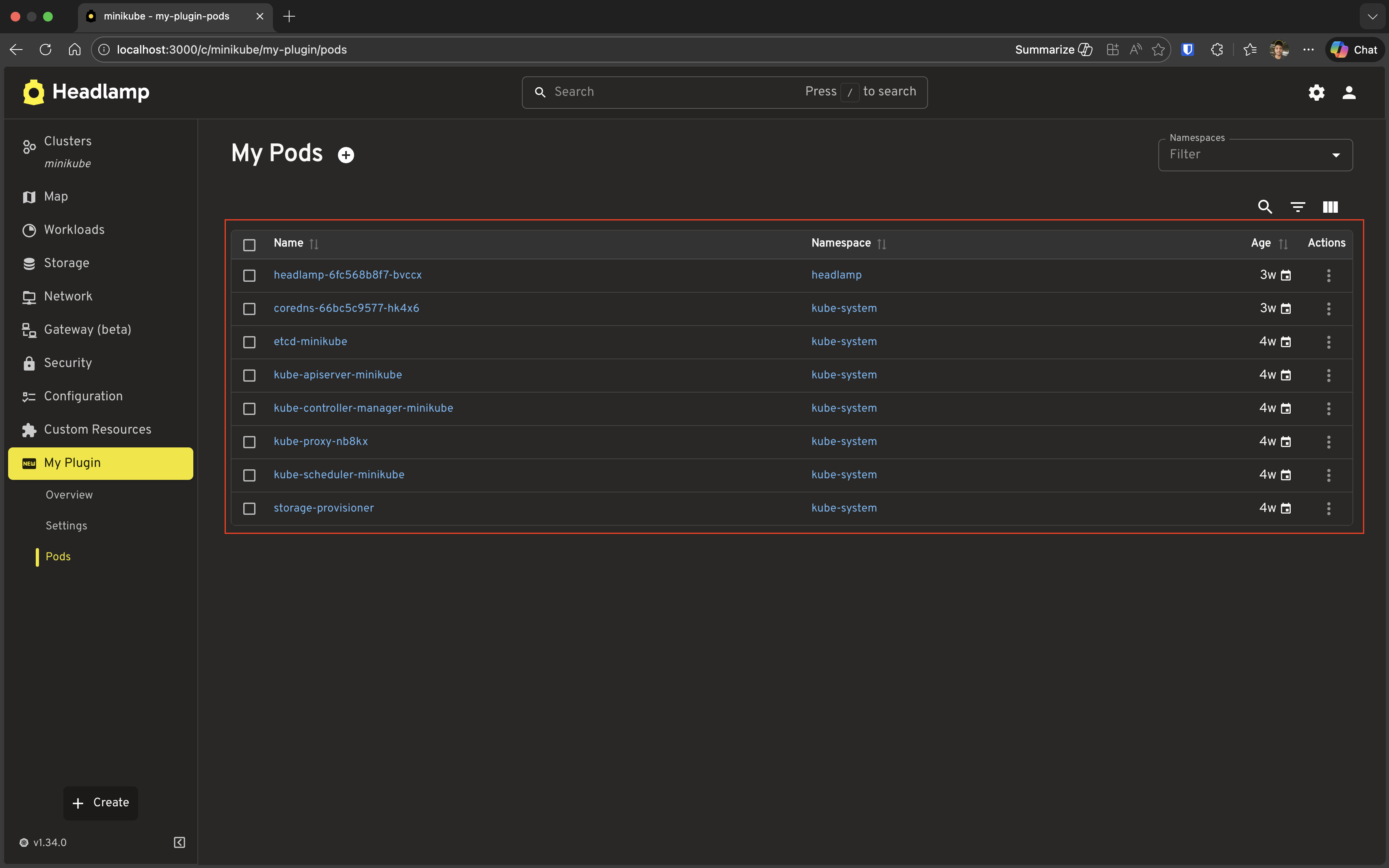
Step 2: Test It
- Save the file
- Navigate to My Plugin → Pods in the sidebar
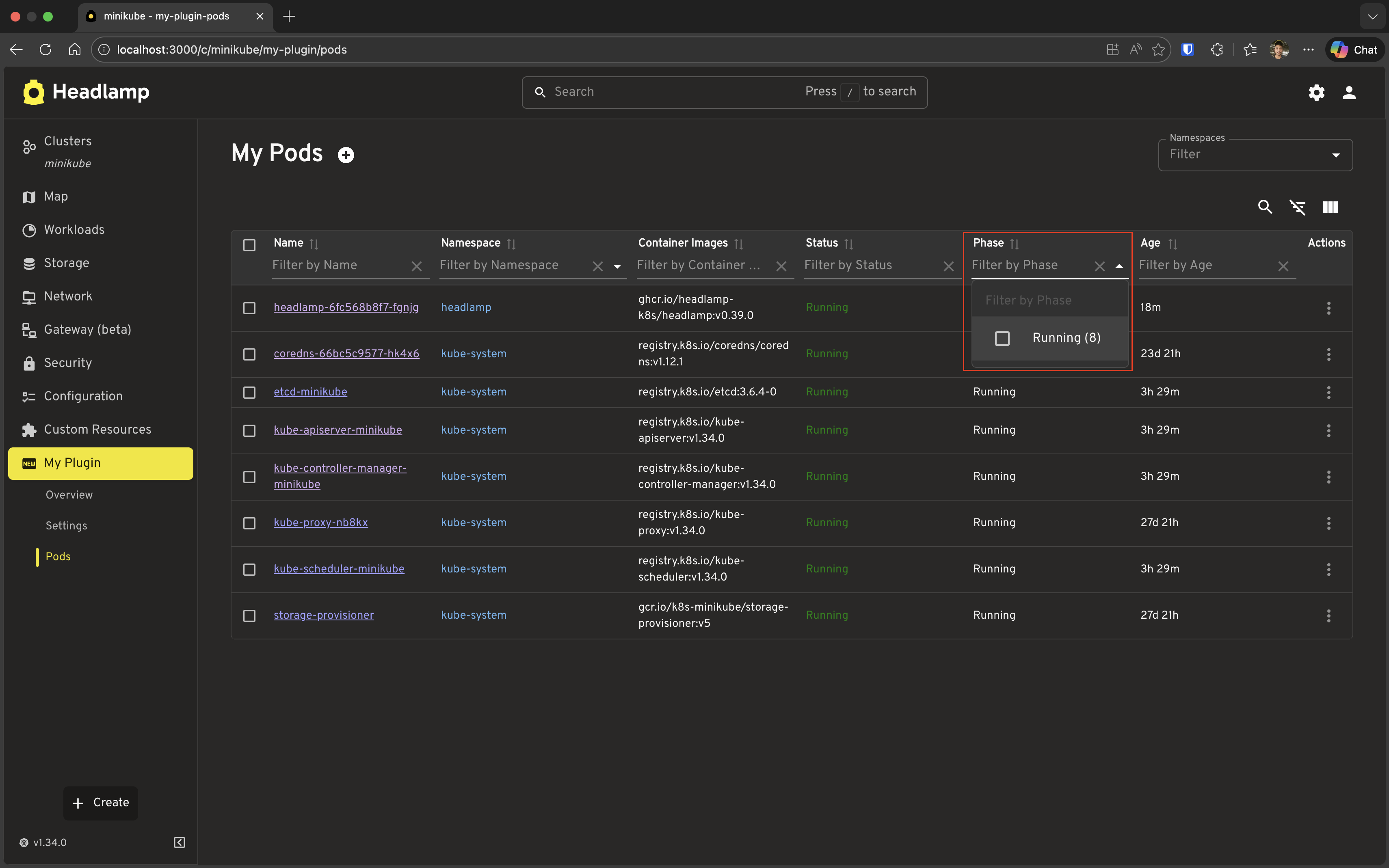
- You should see a professional list view with:
- Sortable columns
- Namespace filter (top-right)
- Row selection checkboxes
- Context menu on each row (three dots)
Notice the improvements:
- Click column headers to sort
- Use the namespace filter to show pods from specific namespaces
- Click the three dots on a row to see actions
- Select multiple rows with checkboxes
Understanding ResourceListView
Now that you've seen it in action, let's look at what ResourceListView gave you for free. Under the hood it handles:
- Data fetching — Automatically calls
useList()from your resource class — no manual hook needed - Loading & error states — Automatic handling, no boilerplate required
- Sorting — Click any column header to sort
- Filtering — Namespace filter for namespaced resources; per-column filters when Show/Hide Filters button is clicked
- Pagination — Large datasets are paginated automatically
- Row context menu — Three-dot menu on every row (you'll extend this in the Customizing section)
- Bulk operations — Row checkboxes for selecting multiple resources
The resourceClass vs data prop
ResourceListView supports two modes:
| Prop | When to use |
|---|---|
resourceClass={MyPod} | Let the component fetch data — the standard approach |
data={items} | Pass pre-fetched or transformed data yourself |
Built-in column shortcuts
'name', 'namespace', 'age', and 'cluster' can be passed as plain strings. They are fully configured columns (including getValue, render, and sorting) — and 'name' renders a link to Headlamp's native detail page for that resource. You can always replace a shortcut with a full column object to override its behaviour.
// Sorting, labels, and links — all configured:
columns={['name', 'namespace', 'age']}
Custom columns: getValue and render
Once you outgrow the built-in shortcuts, you define a column as an object. Two props control how the column behaves:
| Prop | Purpose | Required? |
|---|---|---|
getValue | Returns a plain string or number — used for sorting, filtering, and CSV export | Yes, for custom columns |
render | Returns a React node — used for what's actually displayed in the cell | Optional; falls back to getValue if omitted |
The separation matters: the table sorts and filters against getValue (a consistent raw value), while render handles the visual presentation.
{
  id: 'phase',
  label: 'Phase',
  // Used for sorting A→Z and multi-select filtering:
  getValue: (pod: MyPod) => pod.jsonData.status?.phase || 'Unknown',
  // Used for what the user actually sees in the cell:
  render: (pod: MyPod) => {
    const phase = pod.jsonData.status?.phase;
    const colorMap = { Running: 'success', Failed: 'error', Pending: 'warning' };
    return <Chip label={phase || 'Unknown'} color={colorMap[phase] ?? 'default'} size="small" />;
  },
}
If you only need plain text, you can omit render entirely — getValue covers both:
{
  id: 'containerImages',
  label: 'Container Images',
  getValue: (pod: MyPod) => pod.containerImages?.join(', ') || '-',
}
Building a Pod Detail Page
Let's create a detail page for individual pods.
Step 1: Create the Detail Page Component
Add a new component to your src/index.tsx:
import { useParams } from 'react-router-dom';
import {
  registerRoute,
  registerSidebarEntry,
} from '@kinvolk/headlamp-plugin/lib';
import { getCluster } from '@kinvolk/headlamp-plugin/lib/Utils';
import {
  DetailsGrid,
  SectionBox,
  SimpleTable,
} from '@kinvolk/headlamp-plugin/lib/CommonComponents';
import { Chip } from '@mui/material';
import { MyPod } from './resources/pod';

function MyPodDetailPage() {
    const params = useParams<{ name: string; namespace?: string }>();
    const { name, namespace } = params;
    const cluster = getCluster();

    return (
        <DetailsGrid
            resourceType={MyPod}
            name={name}
            namespace={namespace}
            backLink={`/c/${cluster}/my-plugin/pods`}
            extraInfo={pod => {
                if (!pod) return [];

                return [
                    {
                        name: 'Phase',
                        value: (
                            <Chip
                                label={pod.jsonData.status?.phase || 'Unknown'}
                                color={
                                    pod.jsonData.status?.phase === 'Running'
                                        ? 'success'
                                        : pod.jsonData.status?.phase === 'Failed'
                                            ? 'error'
                                            : pod.jsonData.status?.phase === 'Pending'
                                                ? 'warning'
                                                : 'default'
                                }
                                size="small"
                            />
                        ),
                    },
                    {
                        name: 'Node',
                        value: pod.jsonData.spec.nodeName || 'Not assigned',
                    },
                    {
                        name: 'Pod IP',
                        value: pod.jsonData.status?.podIP || 'Not assigned',
                    },
                ];
            }}
            extraSections={pod => {
                if (!pod) return [];

                return [
                    {
                        id: 'my-plugin-pod-containers',
                        section: (
                            <SectionBox title="Containers">
                                <SimpleTable
                                    data={pod.jsonData.spec.containers}
                                    columns={[
                                        { label: 'Name', getter: container => container.name },
                                        { label: 'Image', getter: container => container.image },
                                        {
                                            label: 'Ports',
                                            getter: container =>
                                                container.ports?.map(p => p.containerPort).join(', ') || '-',
                                        },
                                    ]}
                                />
                            </SectionBox>
                        ),
                    },
                ];
            }}
        />
    );
}
Step 2: Register the Detail Route
Add the route registration for the detail page. The :namespace and :name segments in the path are URL parameters: for a URL like /my-plugin/default/pods/nginx-pod, namespace will be "default" and name will be "nginx-pod". These values are injected into MyPodDetailPage via useParams<{ name: string; namespace?: string }>(), which is why we can read const { name, namespace } = params; in the component:
registerRoute({
  path: '/my-plugin/:namespace/pods/:name',
  sidebar: 'my-plugin-pods',
  component: MyPodDetailPage,
});
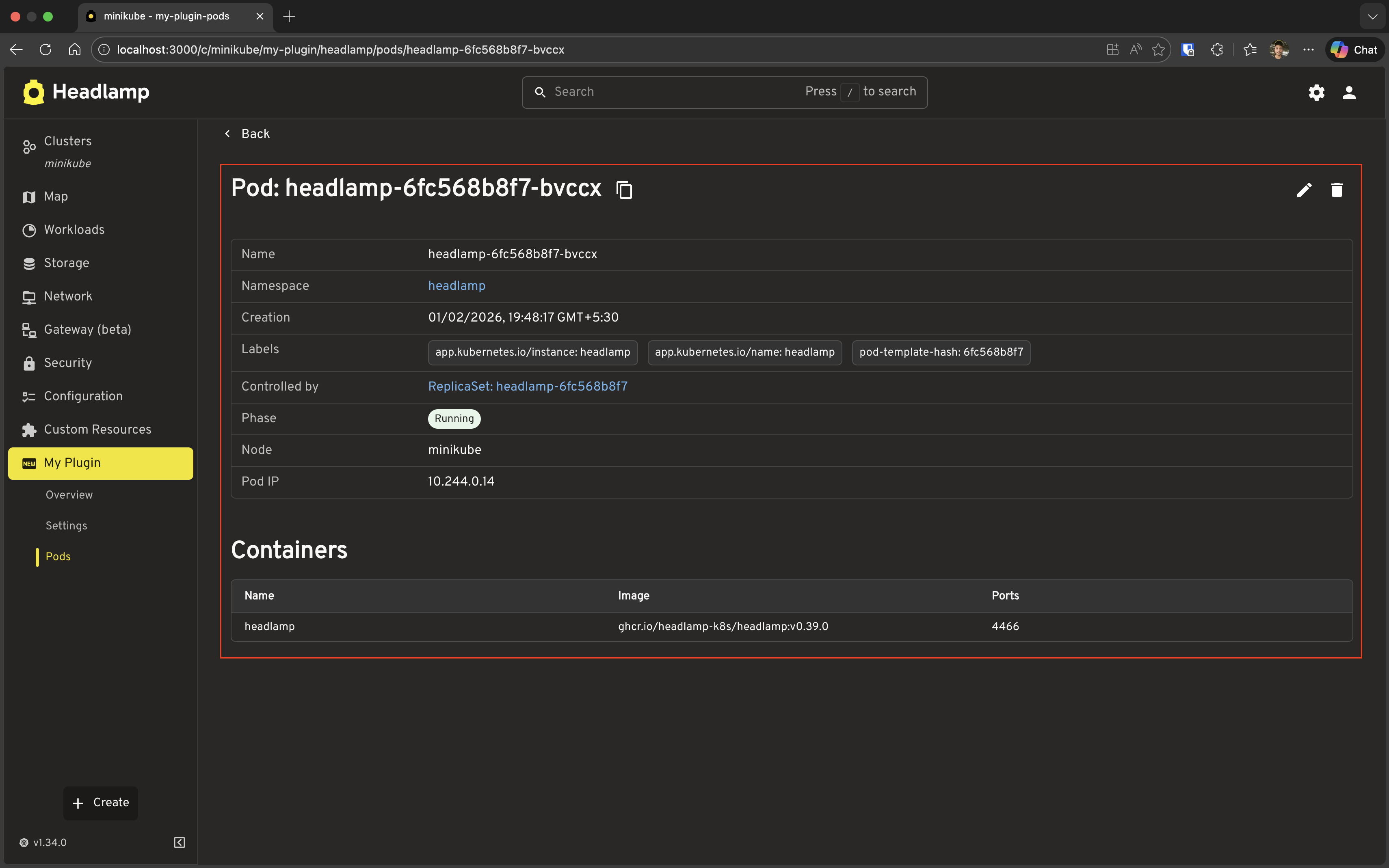
Step 3: Test It
- Save the file
- Navigate to the Pods list page
- Click on a pod name (or use the context menu → View)
- You should see the detail page with:
- Standard metadata (name, namespace, labels, etc.)
- Your custom fields (Phase, Node, Pod IP)
- Your custom Containers section
Understanding DetailsGrid
Now that you've seen it working, here's what DetailsGrid handled automatically:
- Resource fetching — Calls
useGet()from your resource class using thenameandnamespaceprops - Loading & error states — Automatic handling with consistent UI
- Standard metadata display — Name, namespace, labels, annotations, and creation time are always shown
- Back navigation —
backLinkrenders a back button in the header extraInfo— A list of name/value pairs rendered as additional rows in the metadata tableextraSections— Arbitrary React content rendered as full-width sections below the metadata- Events — Pass
withEventsto append the Kubernetes event stream for the resource:
<DetailsGrid
  resourceType={MyPod}
  name={name}
  namespace={namespace}
  withEvents
/>
The extraInfo vs extraSections choice
| Use | When |
|---|---|
extraInfo | Key/value facts that belong alongside the standard metadata (phase, node, pod IP) |
extraSections | Richer content that needs its own heading and layout (container list, status table) |
Basic Usage
import { DetailsGrid } from '@kinvolk/headlamp-plugin/lib/CommonComponents';

<DetailsGrid
  resourceType={MyPod}
  name={podName}
  namespace={namespace}
/>
With just those three props you get the full standard detail layout — identical to what Headlamp shows for its own built-in resources.
Adding Actions to Detail Page
DetailsGrid already provides default actions for common operations — for example, Pods automatically get Edit and Evict buttons in the header. But you'll often want to add your own custom actions.
The actions prop lets you place action buttons in the detail page header. Each action is rendered using ActionButton, a Headlamp CommonComponent that renders an icon button with a tooltip. It keeps your actions visually consistent with Headlamp's built-in actions.
<ActionButton
  description="Tooltip text"    // Shown on hover
  icon="mdi:icon-name"          // Iconify icon identifier
  onClick={() => { ... }}        // Click handler
/>
Note: Since
DetailsGridalready provides a default evict action for Pods, we'll technically be adding a second one here. That's fine for learning — it lets us reuse the evict logic from Tutorial 5 while focusing on how custom actions work. In a real plugin you'd use this pattern for actions that aren't provided by default.
Step 1: Add a Custom Evict Action to DetailsGrid
Let's integrate the evict functionality from Tutorial 5 into our DetailsGrid header. Update your MyPodDetailPage:
import { useState } from 'react';
import { useParams, useHistory } from 'react-router-dom';
import {
  registerRoute,
  registerSidebarEntry,
} from '@kinvolk/headlamp-plugin/lib';
import { getCluster } from '@kinvolk/headlamp-plugin/lib/Utils';
import {
  DetailsGrid,
  SectionBox,
  SimpleTable,
  ActionButton,
} from '@kinvolk/headlamp-plugin/lib/CommonComponents';
import { Chip, Snackbar } from '@mui/material';
import { MyPod } from './resources/pod';

function MyPodDetailPage() {
  const params = useParams<{ name: string; namespace?: string }>();
  const { name, namespace } = params;
  const history = useHistory();
  const cluster = getCluster();
  const [snackbar, setSnackbar] = useState<{ open: boolean; message: string }>({
    open: false,
    message: '',
  });

  const handleEvict = async (pod: MyPod) => {
    if (!cluster) {
      setSnackbar({ open: true, message: 'No cluster selected' });
      return;
    }
    try {
      await pod.evict(cluster);
      setSnackbar({ open: true, message: `Evicting ${pod.metadata.name}...` });
      setTimeout(() => {
        history.push(`/c/${cluster}/my-plugin/pods`);
      }, 1000);
    } catch (err: any) {
      setSnackbar({ open: true, message: `Error: ${err.message}` });
    }
  };

  return (
    <>
      <DetailsGrid
        resourceType={MyPod}
        name={name}
        namespace={namespace}
        backLink={`/c/${cluster}/my-plugin/pods`}
        actions={pod => {
          if (!pod) return [];

          return [
            {
              id: 'evict-pod',
              action: (
                <ActionButton
                  description="Evict Pod"
                  icon="mdi:delete-outline"
                  onClick={() => {
                    if (window.confirm(`Are you sure you want to evict pod "${pod.metadata.name}"?`)) {
                      handleEvict(pod);
                    }
                  }}
                />
              ),
            },
          ];
        }}
        extraInfo={pod => {
          if (!pod) return [];

          return [
            {
              name: 'Phase',
              value: (
                <Chip
                  label={pod.jsonData.status?.phase || 'Unknown'}
                  color={
                    pod.jsonData.status?.phase === 'Running'
                      ? 'success'
                      : pod.jsonData.status?.phase === 'Failed'
                        ? 'error'
                        : pod.jsonData.status?.phase === 'Pending'
                          ? 'warning'
                          : 'default'
                  }
                  size="small"
                />
              ),
            },
            {
              name: 'Node',
              value: pod.jsonData.spec.nodeName || 'Not assigned',
            },
            {
              name: 'Pod IP',
              value: pod.jsonData.status?.podIP || 'Not assigned',
            },
          ];
        }}
        extraSections={pod => {
          if (!pod) return [];

          return [
            {
              id: 'my-plugin-pod-containers',
              section: (
                <SectionBox title="Containers">
                  <SimpleTable
                    data={pod.jsonData.spec.containers}
                    columns={[
                      { label: 'Name', getter: container => container.name },
                      { label: 'Image', getter: container => container.image },
                      {
                        label: 'Ports',
                        getter: container =>
                          container.ports?.map(p => p.containerPort).join(', ') || '-',
                      },
                    ]}
                  />
                </SectionBox>
              ),
            },
          ];
        }}
      />
      <Snackbar
        open={snackbar.open}
        autoHideDuration={4000}
        onClose={() => setSnackbar({ ...snackbar, open: false })}
        message={snackbar.message}
      />
    </>
  );
}
What's new?
| Addition | Purpose |
|---|---|
actions prop | Function that returns an array of action objects for the header |
ActionButton component | Pre-styled button component for header actions |
handleEvict function | Reuses the evict logic from Tutorial 5 |
| Confirmation dialog | Uses window.confirm to confirm eviction |
| Navigation after eviction | Automatically navigates back to list after successful eviction |
Snackbar | Shows success/error messages |
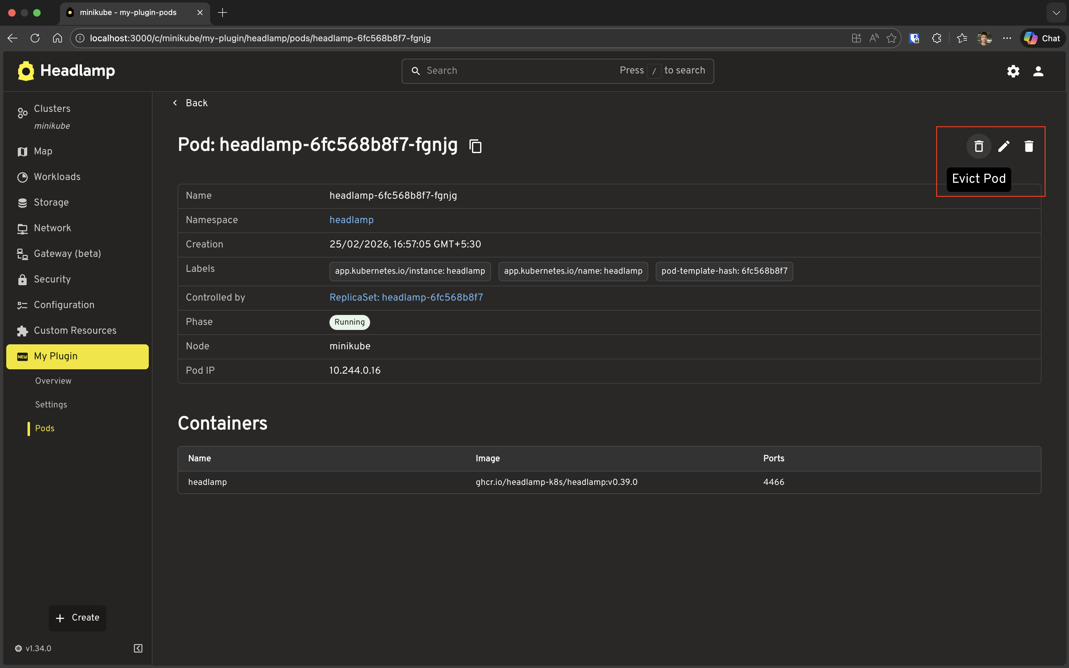
Step 2: Test the Evict Action
- Save the file
- Navigate to a pod detail page
- Look for the "Evict Pod" button in the header (top-right area)
- Click the button
- Confirm the eviction in the dialog
- Watch the snackbar notification and automatic navigation back to the list
Understanding Action Format
The actions prop accepts a function that receives the resource and returns an array of action objects:
actions={pod => {
  if (!pod) return [];

  return [
    {
      id: 'unique-action-id',  // Unique identifier
      action: <ActionButton ... />,  // React node (typically ActionButton)
    },
  ];
}}
Adding Multiple Actions
You can add multiple action buttons to the header:
actions={pod => {
  if (!pod) return [];

  return [
    {
      id: 'view-logs',
      action: (
        <ActionButton
          description="View Logs"
          icon="mdi:file-document-box-outline"
          onClick={() => {
            // Navigate to logs or open log viewer
            console.log('View logs for', pod.metadata.name);
          }}
        />
      ),
    },
    {
      id: 'evict-pod',
      action: (
        <ActionButton
          description="Evict Pod"
          icon="mdi:delete-outline"
          onClick={() => {
            if (window.confirm(`Evict pod "${pod.metadata.name}"?`)) {
              handleEvict(pod);
            }
          }}
        />
      ),
    },
  ];
}}
Conditional Actions
You can conditionally show actions based on the resource state:
actions={pod => {
  if (!pod) return [];

  const actions = [];

  // Only show evict for running pods
  if (pod.jsonData.status?.phase === 'Running') {
    actions.push({
      id: 'evict-pod',
      action: (
        <ActionButton
          description="Evict Pod"
          icon="mdi:delete-outline"
          onClick={() => {
            if (window.confirm(`Evict pod "${pod.metadata.name}"?`)) {
              handleEvict(pod);
            }
          }}
        />
      ),
    });
  }

  return actions;
}}
Key Points:
- Actions are evaluated when the resource loads, so you can customize based on resource state
- Use
ActionButtonfor consistent styling with Headlamp's design system - Always provide user feedback (Snackbar, dialogs) for destructive actions
- Consider navigating away after successful destructive operations
Navigation Between List and Detail
Now we need to make the list page link to the detail page. ResourceListView automatically makes resource names clickable, but we need to configure the route pattern.
Step 1: Update ResourceListView to Link to Details
The built-in 'name' column shortcut links to Headlamp's native detail page for a resource. Since we registered our own detail route at /my-plugin/:namespace/pods/:name, we need a custom name column that navigates there instead.
URL structure note: Plugin routes are registered without the
/c/<cluster>prefix (e.g.path: '/my-plugin/:namespace/pods/:name'). Headlamp's router adds/c/<cluster-name>in the browser automatically. When you buildhrefvalues orbackLinkstrings yourself, you must include it — which is whygetCluster()is needed.
Replace only the MyPodsPage function in your src/index.tsx (keep MyPodDetailPage and all registerRoute/registerSidebarEntry calls). This version uses Headlamp's Link CommonComponent for navigation.
import {
  registerRoute,
  registerSidebarEntry,
} from '@kinvolk/headlamp-plugin/lib';
import { getCluster } from '@kinvolk/headlamp-plugin/lib/Utils';
import { ResourceListView, Link } from '@kinvolk/headlamp-plugin/lib/CommonComponents';
import { MyPod } from './resources/pod';

function MyPodsPage() {
  const cluster = getCluster();

  return (
    <ResourceListView
      title="My Pods"
      resourceClass={MyPod}
      columns={[
        {
          id: 'name',
          label: 'Name',
          getValue: (pod: MyPod) => pod.metadata.name,
          render: (pod: MyPod) => (
            <Link
              to={`/c/${cluster}/my-plugin/${pod.metadata.namespace}/pods/${pod.metadata.name}`}
            >
              {pod.metadata.name}
            </Link>
          ),
        },
        'namespace',
        {
          id: 'containerImages',
          label: 'Container Images',
          getValue: (pod: MyPod) => pod.containerImages?.join(', ') || '-',
        },
        {
          id: 'age',
          label: 'Age',
          getValue: (pod: MyPod) => pod.age,
        },
      ]}
    />
  );
}
Step 2: Back Link on the Detail Page
The backLink prop was already added to MyPodDetailPage in the Building a Pod Detail Page section. It accepts a path string (including the /c/<cluster> prefix) and renders a back button in the detail page header.
Step 3: Test Navigation
- Save both files
- Go to the Pods list page
- Click on a pod name → should navigate to detail page
- Click "Back" → should return to list page
Customizing Columns and Details
Custom Column Rendering
You can customize how columns are displayed using the render property:
columns={[
  {
    id: 'phase',
    label: 'Phase',
    getValue: (pod: MyPod) => pod.jsonData.status?.phase || 'Unknown',
    render: (pod: MyPod) => {
      const phase = pod.jsonData.status?.phase;
      const color = phase === 'Running' ? 'green' : phase === 'Failed' ? 'red' : 'orange';
      return (
        <span style={{ color }}>
          {phase || 'Unknown'}
        </span>
      );
    },
  },
]}
Column Filters
Add filtering to columns:
columns={[
  {
    id: 'phase',
    label: 'Phase',
    getValue: (pod: MyPod) => pod.jsonData.status?.phase || 'Unknown',
    filterVariant: 'multi-select', // or 'text', 'select', etc.
  },
]}
Custom Detail Sections
You can add multiple custom sections:
extraSections={pod => {
  if (!pod) return [];

  return [
    {
      id: 'my-plugin-pod-containers',
      section: (
        <SectionBox title="Containers">
          {/* Your container details */}
        </SectionBox>
      ),
    },
    {
      id: 'my-plugin-pod-status',
      section: (
        <SectionBox title="Status">
          <Typography>
            Phase: {pod.jsonData.status?.phase}
          </Typography>
          <Typography>
            Pod IP: {pod.jsonData.status?.podIP || 'Not assigned'}
          </Typography>
        </SectionBox>
      ),
    },
  ];
}}
Complete Example
Here's the final src/index.tsx for this tutorial. Replace everything in the file with this. It pulls together the list page (with Phase column and clickable names), the detail page (with custom info, sections, and the evict action), and navigation between them.
import { useState } from 'react';
import { useParams, useHistory } from 'react-router-dom';
import {
  registerRoute,
  registerSidebarEntry,
} from '@kinvolk/headlamp-plugin/lib';
import { getCluster } from '@kinvolk/headlamp-plugin/lib/Utils';
import {
  ResourceListView,
  DetailsGrid,
  SectionBox,
  SimpleTable,
  ActionButton,
  Link,
} from '@kinvolk/headlamp-plugin/lib/CommonComponents';
import { Chip, Snackbar } from '@mui/material';
import { MyPod } from './resources/pod';

// List Page
function MyPodsPage() {
  const cluster = getCluster();

  return (
    <ResourceListView
      title="My Pods"
      resourceClass={MyPod}
      columns={[
        {
          id: 'name',
          label: 'Name',
          getValue: (pod: MyPod) => pod.metadata.name,
          render: (pod: MyPod) => (
            <Link
              to={`/c/${cluster}/my-plugin/${pod.metadata.namespace}/pods/${pod.metadata.name}`}
            >
              {pod.metadata.name}
            </Link>
          ),
        },
        'namespace',
        {
          id: 'phase',
          label: 'Phase',
          getValue: (pod: MyPod) => pod.jsonData.status?.phase || 'Unknown',
          filterVariant: 'multi-select',
          render: (pod: MyPod) => {
            const phase = pod.jsonData.status?.phase;
            const colorMap: { [key: string]: 'success' | 'error' | 'warning' | 'default' } = {
              Running: 'success',
              Failed: 'error',
              Pending: 'warning',
            };
            return (
              <Chip
                label={phase || 'Unknown'}
                color={colorMap[phase || ''] || 'default'}
                size="small"
              />
            );
          },
        },
        {
          id: 'containerImages',
          label: 'Container Images',
          getValue: (pod: MyPod) => pod.containerImages?.join(', ') || '-',
        },
        {
          id: 'age',
          label: 'Age',
          getValue: (pod: MyPod) => pod.age,
        },
      ]}
    />
  );
}

// Detail Page
function MyPodDetailPage() {
  const params = useParams<{ name: string; namespace?: string }>();
  const { name, namespace } = params;
  const history = useHistory();
  const cluster = getCluster();
  const [snackbar, setSnackbar] = useState<{ open: boolean; message: string }>({
    open: false,
    message: '',
  });

  const handleEvict = async (pod: MyPod) => {
    if (!cluster) {
      setSnackbar({ open: true, message: 'No cluster selected' });
      return;
    }
    try {
      await pod.evict(cluster);
      setSnackbar({ open: true, message: `Evicting ${pod.metadata.name}...` });
      setTimeout(() => {
        history.push(`/c/${cluster}/my-plugin/pods`);
      }, 1000);
    } catch (err: any) {
      setSnackbar({ open: true, message: `Error: ${err.message}` });
    }
  };

  return (
    <>
      <DetailsGrid
        resourceType={MyPod}
        name={name}
        namespace={namespace}
        backLink={`/c/${cluster}/my-plugin/pods`}
        actions={pod => {
          if (!pod) return [];

          return [
            {
              id: 'evict-pod',
              action: (
                <ActionButton
                  description="Evict Pod"
                  icon="mdi:delete-outline"
                  onClick={() => {
                    if (window.confirm(`Are you sure you want to evict pod "${pod.metadata.name}"?`)) {
                      handleEvict(pod);
                    }
                  }}
                />
              ),
            },
          ];
        }}
        extraInfo={pod => {
          if (!pod) return [];

          return [
            {
              name: 'Phase',
              value: (
                <Chip
                  label={pod.jsonData.status?.phase || 'Unknown'}
                  color={
                    pod.jsonData.status?.phase === 'Running'
                      ? 'success'
                      : pod.jsonData.status?.phase === 'Failed'
                        ? 'error'
                        : pod.jsonData.status?.phase === 'Pending'
                          ? 'warning'
                          : 'default'
                  }
                  size="small"
                />
              ),
            },
            {
              name: 'Node',
              value: pod.jsonData.spec.nodeName || 'Not assigned',
            },
            {
              name: 'Pod IP',
              value: pod.jsonData.status?.podIP || 'Not assigned',
            },
          ];
        }}
        extraSections={pod => {
          if (!pod) return [];

          return [
            {
              id: 'my-plugin-pod-containers',
              section: (
                <SectionBox title="Containers">
                  <SimpleTable
                    data={pod.jsonData.spec.containers}
                    columns={[
                      { label: 'Name', getter: container => container.name },
                      { label: 'Image', getter: container => container.image },
                      {
                        label: 'Ports',
                        getter: container =>
                          container.ports?.map(p => p.containerPort).join(', ') || '-',
                      },
                    ]}
                  />
                </SectionBox>
              ),
            },
          ];
        }}
      />
      <Snackbar
        open={snackbar.open}
        autoHideDuration={4000}
        onClose={() => setSnackbar({ ...snackbar, open: false })}
        message={snackbar.message}
      />
    </>
  );
}

// Register routes
registerRoute({
  path: '/my-plugin/pods',
  sidebar: 'my-plugin-pods',
  component: MyPodsPage,
  exact: true,
});

registerRoute({
  path: '/my-plugin/:namespace/pods/:name',
  sidebar: 'my-plugin-pods',
  component: MyPodDetailPage,
});

// Register sidebar entry
registerSidebarEntry({
  parent: 'my-plugin',
  name: 'my-plugin-pods',
  label: 'Pods',
  url: '/my-plugin/pods',
});
Troubleshooting
ResourceListView Not Showing Data
Check your resource class:
- Ensure
MyPodextendsKubeObjectcorrectly - Verify static properties (
apiVersion,apiName,kind,isNamespaced) are set
Check the columns:
- Ensure
getValuefunctions return valid data - Check browser console for errors
DetailsGrid Not Loading
Check route parameters:
- Ensure
nameis provided in the URL - For namespaced resources, ensure
namespaceis provided
Check resource class:
- Verify
useGet()works:const [pod, error] = MyPod.useGet(name, namespace);
Navigation Not Working
Check route registration:
- Ensure the list route has
exact: trueto prevent it matching detail URLs - The detail route (
/my-plugin/:namespace/pods/:name) must match the URL pattern used in thehref
Check link implementation:
- Verify the
hrefincludes the cluster prefix (/c/${cluster}/...)
Columns Not Sorting/Filtering
Check column configuration:
- Ensure
getValueis provided for sortable columns - For filters, ensure
filterVariantis set correctly
What's Next
You've learned how to build professional list and detail pages:
- ✅ Using
ResourceListViewfor feature-rich list pages - ✅ Using
DetailsGridfor comprehensive detail views - ✅ Adding action buttons to
DetailsGridheader - ✅ Navigation between list and detail pages
- ✅ Customizing columns and detail sections
Coming up in Tutorial 7: Extending Existing Resource Views
- Adding custom sections to built-in resource detail pages
- Customizing existing list views
- Integrating with Headlamp's default views
Quick Reference
ResourceListView Props
<ResourceListView
  title="My Resources"              // Page title (required)
  resourceClass={MyResource}        // Resource class — required unless using `data`
  columns={[...]}                   // Column definitions (required)
  hideColumns={['column-id']}       // Columns to hide (optional)
  actions={[...]}                   // Row context-menu actions — plain array, not a function (optional)
  data={items}                      // Pre-fetched data — use instead of resourceClass (optional)
/>
Column Definition
// Simple string (uses default getValue)
'name'

// Object with custom configuration
{
  id: 'custom-column',              // Unique identifier
  label: 'Display Name',             // Column header
  getValue: (item) => item.field,    // Value getter (for sorting/filtering)
  render: (item) => <Component />,  // Custom render function
  gridTemplate: 1,                  // Column width: number → "fr" (e.g. 1 → "1fr"), or string e.g. "1.5fr", "min-content"
  filterVariant: 'multi-select',     // 'autocomplete' | 'checkbox' | 'date' | 'date-range' | 'datetime' | 'datetime-range' | 'multi-select' | 'range' | 'range-slider' | 'select' | 'text' | 'time' | 'time-range'
  sort: true,                        // Enable/disable sorting
}
DetailsGrid Props
<DetailsGrid
  resourceType={MyResource}          // Resource class — uses useGet automatically (required)
  name={resourceName}                // Resource name (required)
  namespace={namespace}              // Namespace — required for namespaced resources
  cluster={cluster}                  // Cluster name (optional, defaults to current cluster)
  backLink="/path/to/list"           // Back button destination, must include /c/<cluster> prefix (optional)
  withEvents={true}                  // Append the Kubernetes event stream for this resource (optional)
  actions={item => [...]}            // Header action buttons — function, not an array (optional)
  extraInfo={item => [...]}          // Additional key/value info rows (optional)
  extraSections={item => [...]}      // Additional full-width sections (optional)
/>
Actions Definition for DetailsGrid
actions={item => {
  if (!item) return [];

  return [
    {
      id: 'action-id',               // Unique identifier
      action: <ActionButton          // React node (typically ActionButton)
        description="Action Label"
        icon="mdi:icon-name"
        onClick={() => {
          // Handle action
        }}
      />,
    },
  ];
}}
Extra Info Field
{
  name: 'Field Name',                 // Label
  value: 'Field Value',              // Value (string or React node)
  hide: (item) => boolean,           // Conditionally hide field
}
Extra Section
{
  id: 'unique-section-id',          // Unique identifier
  section: <ReactNode />,            // Section content (typically SectionBox)
}