Applying Custom Themes
In Tutorial 8 we made parts of our plugin configurable through a settings page. In this tutorial we will look at a completely different kind of plugin capability: customising the visual appearance of the entire Headlamp application.
Headlamp provides a theming system that lets any plugin register one or more named themes. Once registered, a theme appears as a selectable option in the Themes section of Settings → General, alongside the built-in Light and Dark choices. The entire application — sidebar, navbar, buttons, backgrounds, text — re-renders in your chosen colours.
We will build this up with a concrete, fun example: a Christmas theme that dresses Headlamp in festive deep greens and reds. Along the way we will also learn something equally important: how to make your own plugin components respond to theme changes, so they always look at home regardless of which theme the user has chosen.
Table of Contents
- Introduction
- Registering the Christmas Theme
- The AppTheme Object
- Why Your Plugin Components Should Use Theme Colours
- Updating the Container Images Tooltip to Use Theme Colours
- Replacing the Application Logo
- Building a White-label Headlamp Flavour
- What's Next
- Quick Reference
Introduction
Headlamp's UI is built on Material UI (MUI). Rather than exposing the raw MUI theme object, Headlamp provides a simpler, flatter AppTheme structure. You set the values you care about; everything else inherits from the chosen base theme ('light' or 'dark').
This keeps theming approachable — you don't need to know MUI internals — while still giving fine-grained control over the parts of the UI that matter most: the sidebar, the navbar, the primary accent colour, backgrounds, and typography.
What You'll Build
By the end of this tutorial your plugin will:
- Register a custom "Christmas" theme — a light base with a deep green sidebar and Christmas red accent — selectable from the theme options
- Understand why plugin components must read colours from the active theme rather than hard-coding them
- Update the Container Images tooltip from Tutorial 7 so its colour adapts automatically when any theme (including Christmas) is active
- Replace the application logo with a custom component using
registerAppLogo - Combine a custom theme and logo to produce a white-label Headlamp flavour
Prerequisites
- ✅ Completed Tutorial 7: Extending Existing Resource Views (the Container Images column is the component we will improve)
- ✅ Your
hello-headlampplugin running in Headlamp
Time to complete: ~20 minutes
Registering the Christmas Theme
Registering a theme takes a single import and a single call in src/index.tsx:
import { registerAppTheme } from '@kinvolk/headlamp-plugin/lib';

registerAppTheme({
  name: 'Christmas',
  base: 'light',
  primary: '#c0392b',
});
That's it. After saving, go to Settings → General and your theme will appear as one of the selectable options in the Themes section.
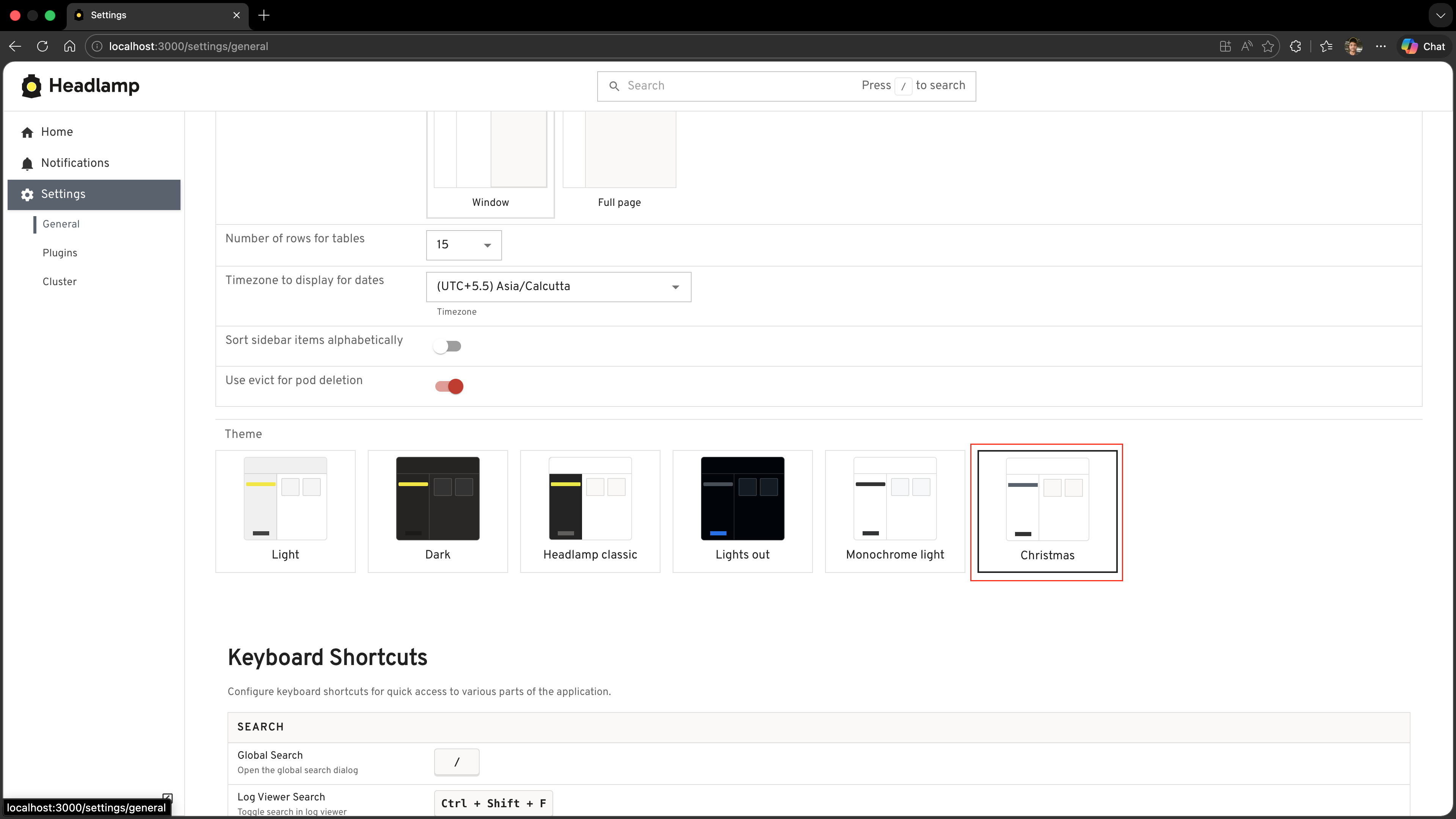
The name field is what the user sees in the theme options — make it descriptive. Once selected, Headlamp stores the user's choice in local storage and restores it on the next visit.
Now let's flesh it out into a proper Christmas theme. Replace the minimal call above with the full version:
import { registerAppTheme } from '@kinvolk/headlamp-plugin/lib';

registerAppTheme({
  name: 'Christmas',
  base: 'light',

  // Christmas red for interactive elements — buttons, links, active states
  primary: '#c0392b',
  secondary: '#f9e79f',

  text: {
    primary: '#212121',
  },
  link: {
    color: '#c0392b',
  },

  background: {
    default: '#fafafa',
    surface: '#ffffff',
    muted: '#fdf6e3',
  },

  // Deep Christmas green sidebar with red active highlight
  sidebar: {
    background: '#1b5e20',
    color: '#c8e6c9',
    selectedBackground: '#c0392b',
    selectedColor: '#ffffff',
    actionBackground: '#145214',
  },

  navbar: {
    background: '#1b5e20',
    color: '#f1f8e9',
  },

  radius: 8,
  buttonTextTransform: 'none',
});
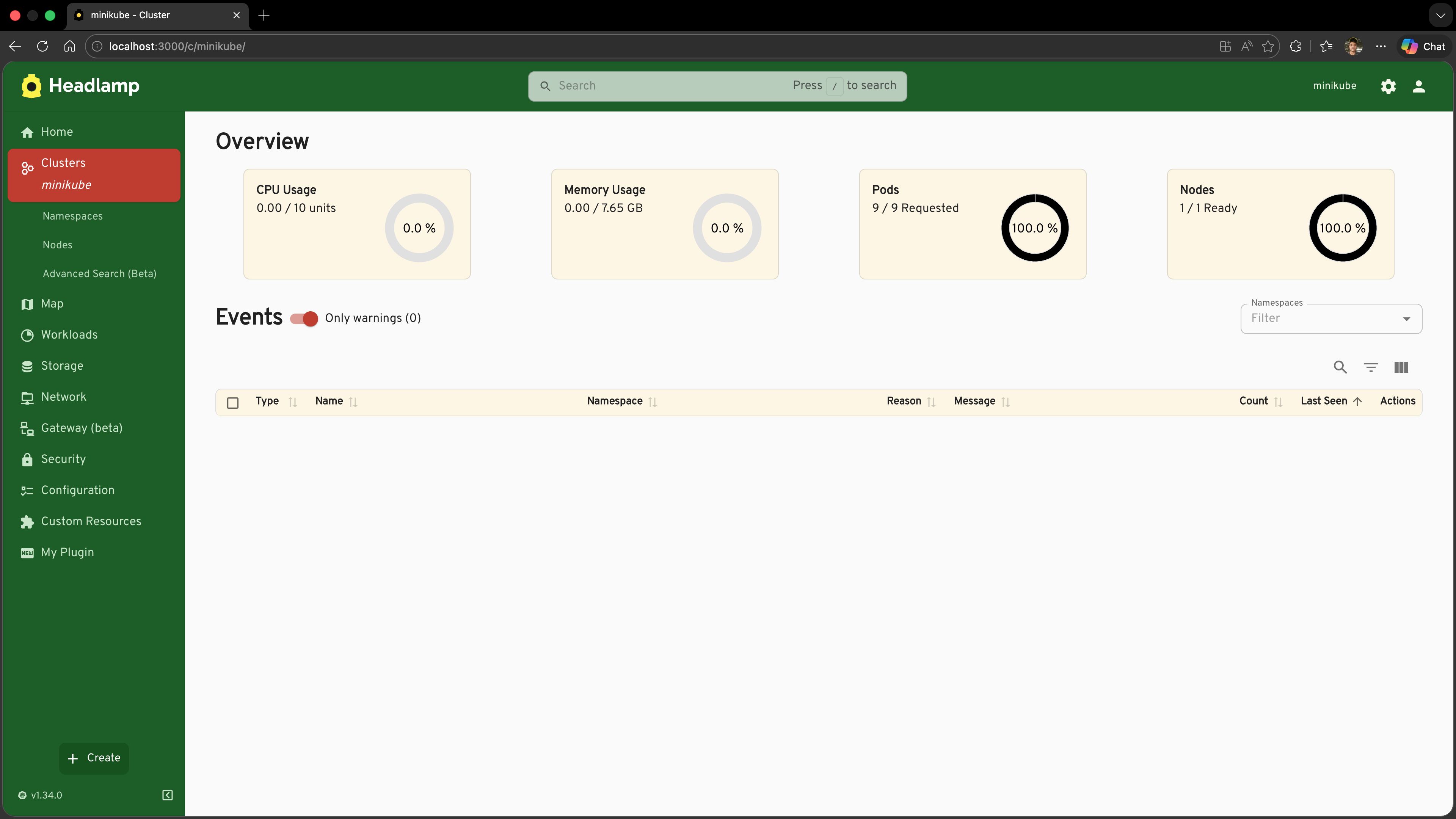
Save the file, go to Settings → General, and choose "Christmas" in the Themes section. The sidebar turns deep festive green, the active navigation item gets a red highlight, and all interactive elements (buttons, focus rings, progress bars) switch to Christmas red.
The AppTheme Object
All fields except name are optional. Anything you omit inherits its value from the base theme.
interface AppTheme {
  name: string;
  base?: 'light' | 'dark';      // which built-in theme to extend (default: 'light')

  primary?: string;              // main accent colour — buttons, links, highlights
  secondary?: string;            // secondary accent colour

  text?: {
    primary?: string;            // body text colour
  };
  link?: {
    color?: string;              // hyperlink colour (defaults to primary if unset)
  };

  background?: {
    default?: string;            // main page background
    surface?: string;            // cards, dialogs, dropdown menus
    muted?: string;              // subtle shaded areas (table row stripes, etc.)
  };

  sidebar?: {
    background?: string;         // sidebar background
    color?: string;              // sidebar icon and text colour
    selectedBackground?: string; // highlight behind the active menu item
    selectedColor?: string;      // text/icon colour for the active menu item
    actionBackground?: string;   // background of the collapse/expand button
  };

  navbar?: {
    background?: string;         // top app bar background
    color?: string;              // top app bar icon and text colour
  };

  radius?: number;               // border radius in px — applied to buttons, chips, dialogs
  buttonTextTransform?: 'uppercase' | 'none'; // button label capitalisation
  fontFamily?: string[];         // font stack, e.g. ['Inter', 'sans-serif']
}
Tips on choosing values
base— Start from'light'if your palette is bright,'dark'if it is muted or dark. Every field you omit falls back to the base values, so you only need to specify what you want to change.primary— This colour drives the most visible interactive elements (active states, focus rings, progress bars). Choose something with enough contrast against both thebackground.defaultandsidebar.background.sidebarvsnavbar— These two surface areas are visually dominant. Setting them explicitly gives your theme a strong identity even if you leave the rest at base values.
Why Your Plugin Components Should Use Theme Colours
Here is the key insight for this tutorial: registering a theme only changes how Headlamp's own built-in components look. Any colour you hard-code in your own plugin components using a plain style attribute will not change when the user switches themes.
Consider the Container Images tooltip we built in Tutorial 7. It renders like this:
// ❌ Hard-coded colour — stays this colour regardless of which theme is active
<Tooltip
  title={images.join('\n')}
  placement="bottom-start"
  componentsProps={{
    tooltip: { sx: { bgcolor: '#c0392b' } },
  }}
>
  ...
</Tooltip>
If the user is running the Christmas theme, this looks fine — the red matches. But if they switch to the built-in Dark theme or the Light theme, the tooltip stays Christmas red. It is out of place; it looks like a bug.
The fix is to read the current primary colour from the active MUI theme at render time, using the useTheme hook:
import { useTheme } from '@mui/material/styles';

function ContainerImagesCell({ pod }: { pod: Pod }) {
  // ✅ Always reads from whatever theme is currently active
  const theme = useTheme();
  const images = pod.spec.containers.map(c => c.image);

  return (
    <Tooltip
      title={images.join('\n')}
      placement="bottom-start"
      componentsProps={{
        tooltip: {
          sx: {
            bgcolor: theme.palette.primary.main,
            color: theme.palette.primary.contrastText,
          },
        },
      }}
    >
      <Typography noWrap style={{ maxWidth: 240, fontSize: 'inherit' }}>
        {images[0]}{images.length > 1 ? ` (+${images.length - 1} more)` : ''}
      </Typography>
    </Tooltip>
  );
}
Now:
- Christmas theme active → tooltip is Christmas red (
#c0392b) - Light theme active → tooltip is black (Headlamp's default primary colour)
- Dark theme active → tooltip is white (Headlamp's default primary colour)
- Any future custom theme → tooltip automatically matches its primary colour
This is the right pattern for every colour a plugin component displays. Whenever you would otherwise write a colour literal like '#c0392b' or 'rgba(255,0,0,0.8)', ask: "Should this change when the user switches themes?". If yes, reach for useTheme() and pull the value from theme.palette.
The most useful theme palette values
theme.palette.* | What it represents |
|---|---|
primary.main | The primary accent colour — same as AppTheme.primary |
primary.contrastText | A text colour guaranteed to be readable on top of primary.main |
secondary.main | The secondary accent colour |
background.default | The main page background |
background.paper | Cards, dialogs, surface areas |
text.primary | The main body text colour |
text.secondary | Subdued text, hints, secondary labels |
Updating the Container Images Tooltip to Use Theme Colours
Let's apply this pattern to the actual code from Tutorial 7. We need to:
- Extract the tooltip cell into a small React component (so we can use the
useThemehook) - Replace the hard-coded colour with
theme.palette.primary.main
Step 1: Import useTheme
Add useTheme to your existing MUI imports in src/index.tsx:
import { Tooltip, Typography } from '@mui/material';
import { useTheme } from '@mui/material/styles';
Step 2: Create the ContainerImagesCell Component
Add this component before the registerResourceTableColumnsProcessor call:
function ContainerImagesCell({ pod }: { pod: Pod }) {
  const theme = useTheme();
  const images = pod.spec.containers.map(c => c.image);

  return (
    <Tooltip
      title={images.join('\n')}
      placement="bottom-start"
      componentsProps={{
        tooltip: {
          sx: {
            bgcolor: theme.palette.primary.main,
            color: theme.palette.primary.contrastText,
            fontSize: '0.8rem',
            whiteSpace: 'pre-line',
          },
        },
      }}
    >
      <Typography noWrap style={{ maxWidth: 240, fontSize: 'inherit' }}>
        {images[0]}{images.length > 1 ? ` (+${images.length - 1} more)` : ''}
      </Typography>
    </Tooltip>
  );
}
Step 3: Update the Column Registration
In your existing registerResourceTableColumnsProcessor call, replace the inline render function with the new component:
registerResourceTableColumnsProcessor(function addContainerImagesColumn({ id, columns }) {
  if (id !== 'headlamp-pods') {
    return columns;
  }

  const podColumns = columns as ResourceTableColumn<Pod>[];

  podColumns.push({
    id: 'hello-headlamp-container-images',
    label: 'Container Images',
    getValue: (pod: Pod) => pod.spec.containers.map(c => c.image).join(', '),
    render: (pod: Pod) => <ContainerImagesCell pod={pod} />,  // ← uses useTheme internally
  });

  return columns;
});
Step 4: Test It
- Save the file
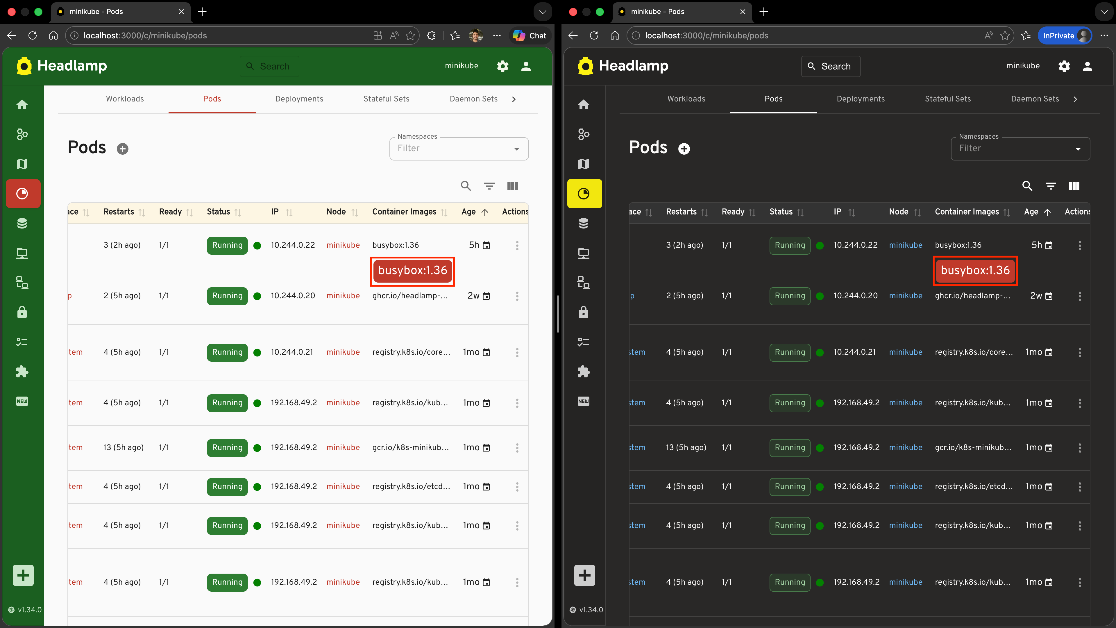
- Navigate to Workloads → Pods and hover over a cell in the Container Images column
- You should see the tooltip appear with a Christmas red background — because the Christmas theme is active and its
primaryis#c0392b
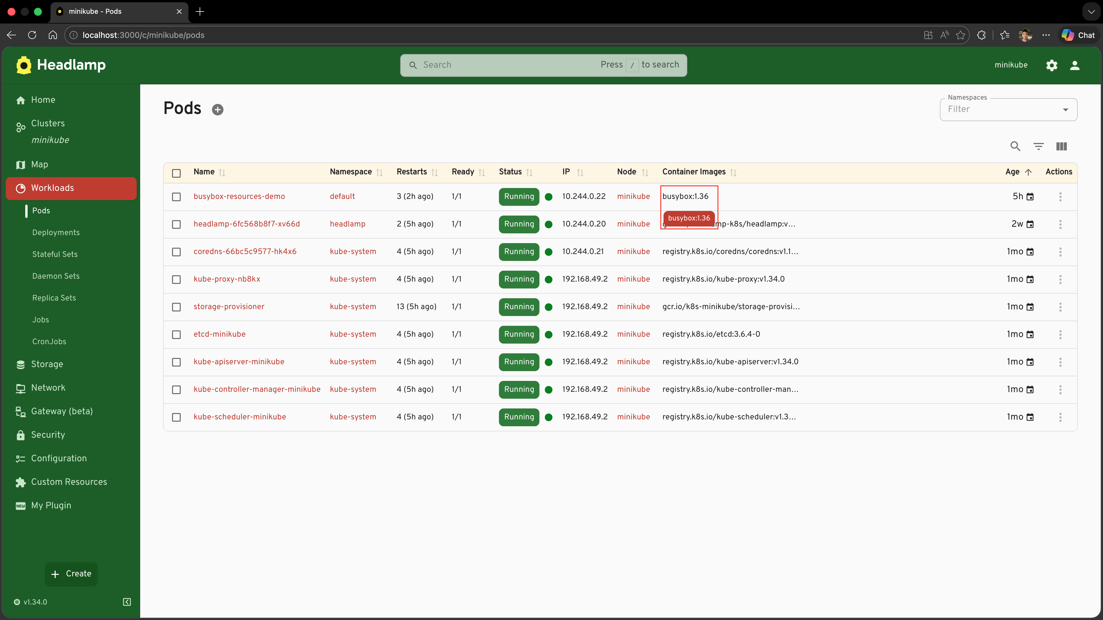
- Now go to Settings → General and choose Light in the Themes section, then hover again
- The tooltip is now black — Headlamp's default primary colour for the Light theme
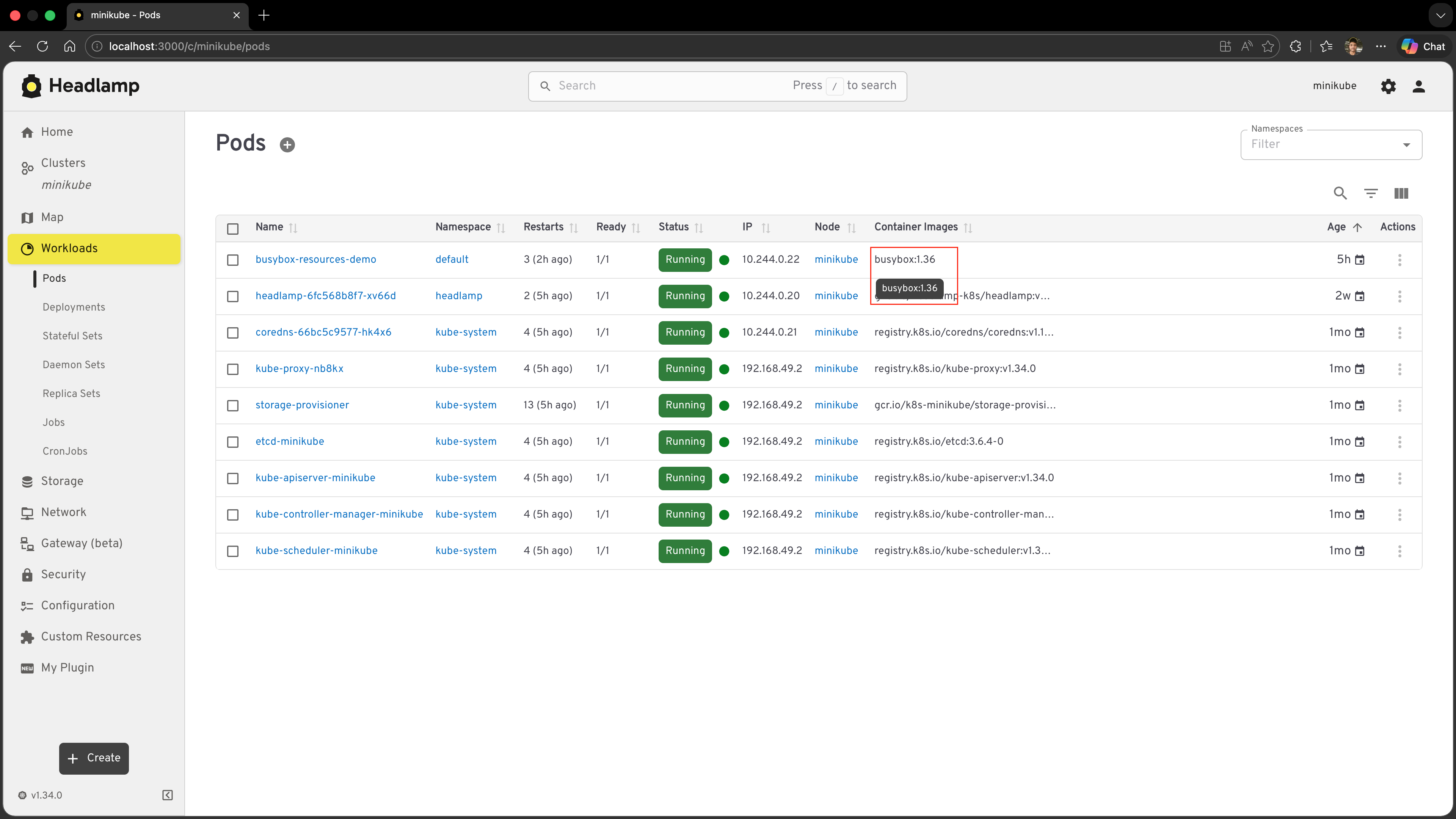
The tooltip automatically follows whichever theme the user has selected, with no extra code on your part. This is what it means for a plugin to be coherent with the app.
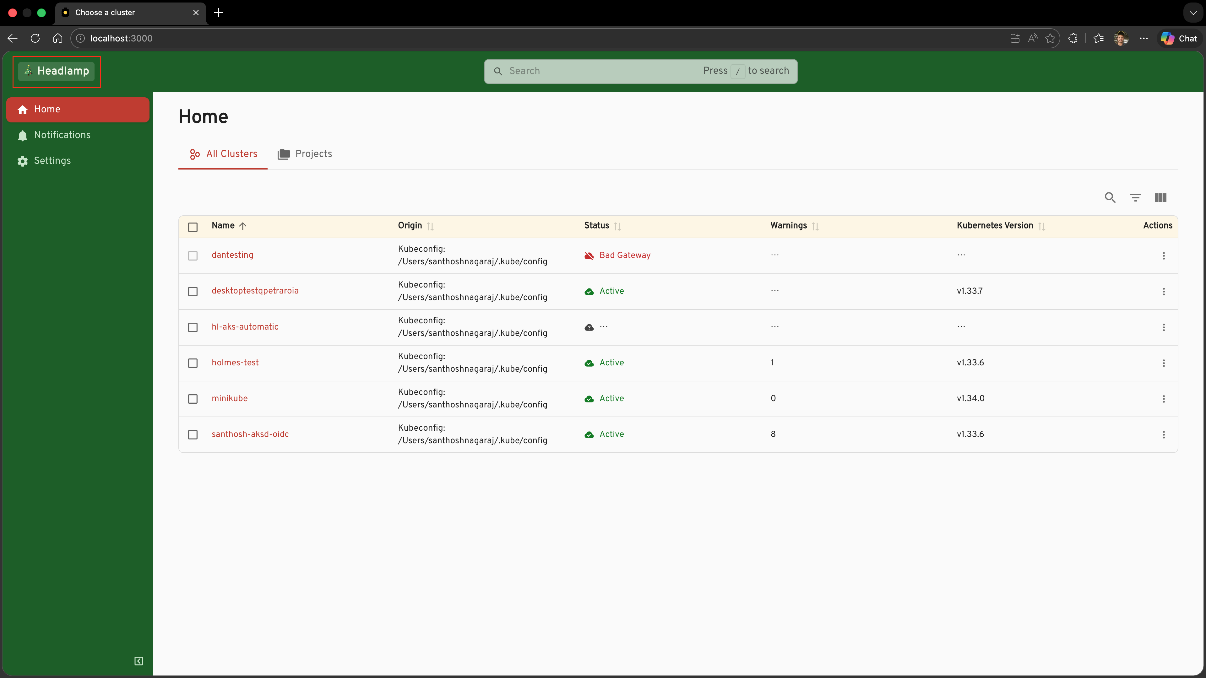
Replacing the Application Logo
registerAppLogo lets you swap out the Headlamp logo that appears in the sidebar and the top bar. It is a natural companion to registerAppTheme — combine them and your users see your branding everywhere.
registerAppLogo accepts either a React element (always renders the same thing) or a React component that receives AppLogoProps and can adapt to context.
Adding a Christmas tree logo
For a festive touch, let's swap the Headlamp logo for a Christmas tree. The component receives AppLogoProps and can adapt based on logoType (whether the sidebar is expanded or collapsed):
import { AppLogoProps, registerAppLogo } from '@kinvolk/headlamp-plugin/lib';

function ChristmasLogo({ logoType }: AppLogoProps) {
  const style = {
    background: 'rgba(255, 255, 255, 0.15)',
    borderRadius: 4,
    padding: '2px 8px',
  };

  if (logoType === 'small') {
    return <span style={{ ...style, fontSize: '1.4rem', padding: '2px 4px' }}>🎄</span>;
  }

  return (
    <span style={{ ...style, fontSize: '1.1rem', fontWeight: 700, letterSpacing: '0.02em' }}>
      🎄 Headlamp
    </span>
  );
}

registerAppLogo(ChristmasLogo);
Only one logo at a time. If multiple plugins call
registerAppLogo, the last registration wins. This is intentional — a single logo is always shown.
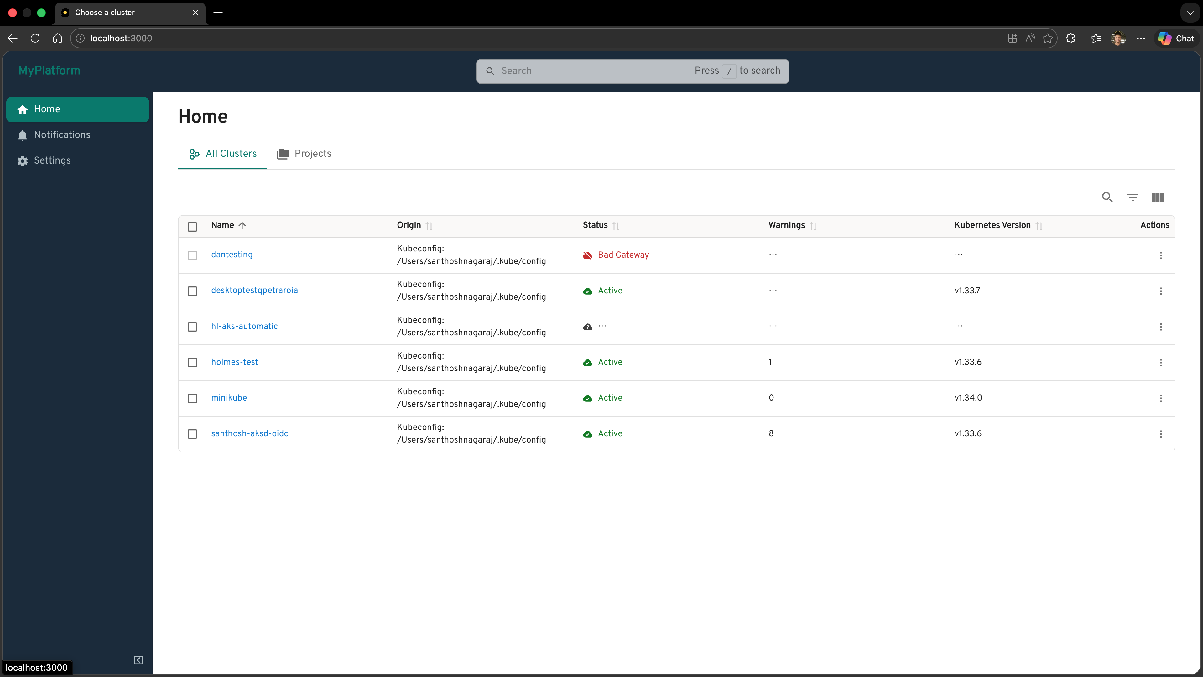
Building a White-label Headlamp Flavour
Combining a custom theme and a custom logo is the standard pattern for shipping a branded flavour of Headlamp — for example, an internal platform portal, a managed Kubernetes product, or an enterprise console.
A typical white-label src/index.tsx looks like this:
import { registerAppLogo, registerAppTheme, AppLogoProps } from '@kinvolk/headlamp-plugin/lib';

// ── 1. Register a branded theme ───────────────────────────────────────────────

registerAppTheme({
  name: 'MyPlatform',
  base: 'light',
  primary: '#00796b',
  secondary: '#e0f2f1',
  sidebar: {
    background: '#1a2b3c',
    color: '#b0bec5',
    selectedBackground: '#00796b',
    selectedColor: '#ffffff',
    actionBackground: '#0d1b2a',
  },
  navbar: {
    background: '#1a2b3c',
    color: '#eceff1',
  },
  radius: 8,
  buttonTextTransform: 'none',
});

// ── 2. Replace the logo ────────────────────────────────────────────────────────

function MyPlatformLogo({ logoType, themeName }: AppLogoProps) {
  if (logoType === 'small') {
    return <span style={{ fontWeight: 'bold' }}>MP</span>;
  }
  const color = themeName === 'dark' ? '#4db6ac' : '#00796b';
  return <span style={{ fontWeight: 700, fontSize: '1.2rem', color }}>MyPlatform</span>;
}

registerAppLogo(MyPlatformLogo);
After the user chooses the "MyPlatform" theme in the Themes section of Settings → General, the entire application takes on the branded look — your logo, your colours, your typography.
What's Next
You've learned how to fully customise the look of the whole Headlamp application, and — just as importantly — how to make your plugin's own components respect that customisation:
- ✅ Using
registerAppThemeto register a named theme (the Christmas theme) - ✅ Understanding every field in the
AppThemeobject - ✅ Why hard-coding colours in plugin components breaks theme coherence
- ✅ Using
useTheme()to read the active theme's palette at render time - ✅ Applying this pattern to the Container Images tooltip from Tutorial 7
- ✅ Replacing the application logo with
registerAppLogo - ✅ Combining theme and logo to ship a white-label Headlamp flavour
Coming up in Tutorial 10: Adding Custom Map Nodes
- Registering custom node types for the Headlamp resource map
- Controlling how your resources are visualised in the topology view
Quick Reference
registerAppTheme
import { registerAppTheme } from '@kinvolk/headlamp-plugin/lib';

registerAppTheme({
  name: 'My Theme',          // shown in the Themes section of Settings → General (required)
  base: 'light',             // 'light' | 'dark' — what to inherit from (default: 'light')

  primary: '#hex',           // accent colour
  secondary: '#hex',         // secondary accent

  text: { primary: '#hex' },
  link: { color: '#hex' },

  background: {
    default: '#hex',         // page background
    surface: '#hex',         // cards / dialogs
    muted: '#hex',           // subtle shading
  },

  sidebar: {
    background: '#hex',
    color: '#hex',
    selectedBackground: '#hex',
    selectedColor: '#hex',
    actionBackground: '#hex',
  },

  navbar: {
    background: '#hex',
    color: '#hex',
  },

  radius: 8,                          // border radius in px
  buttonTextTransform: 'none',        // 'none' | 'uppercase'
  fontFamily: ['Inter', 'sans-serif'],
});
Using useTheme in plugin components
import { useTheme } from '@mui/material/styles';

function MyPluginComponent() {
  const theme = useTheme();

  return (
    <div style={{ color: theme.palette.primary.main }}>
      This text colour matches the active theme's primary accent.
    </div>
  );
}
Useful palette tokens:
| Token | Meaning |
|---|---|
theme.palette.primary.main | Primary accent (buttons, links, highlights) |
theme.palette.primary.contrastText | Readable text colour on top of primary.main |
theme.palette.secondary.main | Secondary accent |
theme.palette.background.default | Page background |
theme.palette.background.paper | Card / dialog surface |
theme.palette.text.primary | Main body text |
theme.palette.text.secondary | Subdued / secondary text |
registerAppLogo
import { registerAppLogo, AppLogoProps } from '@kinvolk/headlamp-plugin/lib';

// Simple — a React element (always the same)
registerAppLogo(<img src="/my-logo.svg" alt="My Logo" style={{ height: 32 }} />);

// Adaptive — a React component that receives context props
function MyLogo({ logoType, themeName }: AppLogoProps) {
  // logoType: 'large' (sidebar expanded) | 'small' (sidebar collapsed)
  // themeName: 'light' | 'dark'
  if (logoType === 'small') {
    return <span style={{ fontWeight: 'bold' }}>ML</span>;
  }
  return (
    <span style={{ fontWeight: 700, color: themeName === 'dark' ? '#fff' : '#000' }}>
      MyLogo
    </span>
  );
}

registerAppLogo(MyLogo);