Adding Plugin Settings
In Tutorial 7 we extended Headlamp's built-in Pods list and detail views by injecting a Container Images column, an Image Details action button, and a Container Resources section. Those extensions are always active — the user has no way to turn them on or off.
In this tutorial we will make the Image Details button configurable. We'll add a plugin settings page where users can toggle the button on or off with a switch. This will cover:
- Defining a typed
ConfigStoreto persist plugin configuration - Extracting config logic into a reusable utility module
- Building a settings UI component with
registerPluginSettings - Reading config reactively inside a React component using
store.useConfig()
Table of Contents
- Introduction
- How Plugin Settings Work
- Step 1 — Define the Config Type and Store
- Step 2 — Build the Settings UI Component
- Step 3 — Register the Settings Page
- Step 4 — Make the Button Respect the Setting
- Understanding ConfigStore
- Understanding registerPluginSettings
- Complete Example
- Troubleshooting
- What's Next
- Quick Reference
Introduction
Headlamp has a built-in Plugin Settings page (accessible via Settings → Plugins → your plugin name). To add a settings UI for your plugin, you register a React component with registerPluginSettings. Headlamp renders your component on that page and your component reads and writes configuration through a ConfigStore instance.
ConfigStore gives you three ways to interact with your plugin's config:
| Method | When to use |
|---|---|
store.get() | Read config once, outside React (e.g. in a processor function) |
store.set(value) / store.update(partial) | Write or update config (from any context) |
store.useConfig() | Read config reactively inside a React component |
What You'll Build
By the end of this tutorial your plugin will have:
- A
src/config.tsmodule that defines the config type and exports the sharedConfigStoreinstance - A
src/settings.tsxsettings component with an on/off toggle for the Image Details button - The
ImageDetailsActioncomponent from Tutorial 7 updated to react to the setting in real time
Prerequisites
Before starting, ensure you have:
- ✅ Completed Tutorial 7: Extending Existing Resource Views
- ✅ Your
hello-headlampplugin with the Image Details button from Tutorial 7 - ✅ Headlamp running with a connected cluster
Time to complete: ~20 minutes
How Plugin Settings Work
The Image Details button is a React component registered via registerDetailsViewHeaderAction. Because it is a React component, it can call store.useConfig() to subscribe to config changes. When config is saved, the component re-renders automatically — the button appears or disappears immediately without any page navigation.
User flips the toggle in Settings → Plugins → hello-headlamp
         │
         ▼
settings.tsx calls onDataChange({ showImageDetails: true/false })
         │
         ▼
User clicks Save → Headlamp persists the config via ConfigStore
         │
         ▼
ImageDetailsAction re-renders via useConfig() → returns null or the button
The key difference compared to using store.get() in a processor function is that useConfig() subscribes to the config. Any component using it re-renders the instant the config is saved — no navigation needed.
Step 1 — Define the Config Type and Store
Start by creating a dedicated file for your plugin's configuration. This keeps the ConfigStore instance and the config type in one place and avoids circular imports when both settings.tsx and index.tsx need to reference them.
Create the file src/config.ts:
import { ConfigStore } from '@kinvolk/headlamp-plugin/lib';

/**
 * Shape of the hello-headlamp plugin configuration.
 * Add new settings here as the plugin grows.
 */
export interface HelloHeadlampConfig {
  /** Whether to show the Image Details button on Pod detail pages. */
  showImageDetails: boolean;
}

/**
 * Default values applied the first time the plugin loads (before the user
 * visits the settings page).
 */
export const DEFAULT_CONFIG: HelloHeadlampConfig = {
  showImageDetails: true,
};

/**
 * Shared ConfigStore instance for the hello-headlamp plugin.
 * Import this from any file that needs to read or write plugin config.
 *
 * The key ('hello-headlamp') must match the plugin name passed to
 * registerPluginSettings.
 */
export const store = new ConfigStore<HelloHeadlampConfig>('hello-headlamp');

/**
 * Convenience helper — returns the current config, falling back to defaults
 * for any keys that haven't been set yet.
 *
 * Safe to call outside React (e.g. in processor functions).
 */
export function getConfig(): HelloHeadlampConfig {
  return { ...DEFAULT_CONFIG, ...store.get() };
}
Why a separate file?
Both settings.tsx and index.tsx need the same ConfigStore instance. Putting it in its own file means:
- There is exactly one store instance shared across the whole plugin
- The config type (
HelloHeadlampConfig) is defined in one place - The
getConfig()helper applies defaults so callers never have to worry aboutundefinedvalues on first load
Step 2 — Build the Settings UI Component
Now create the settings UI component. Headlamp injects the current saved config as data and a staging callback as onDataChange; the user confirms changes by clicking Save.
Create the file src/settings.tsx:
import { FormControlLabel, Switch, Typography, Box } from '@mui/material';
import { PluginSettingsDetailsProps } from '@kinvolk/headlamp-plugin/lib';
import { DEFAULT_CONFIG } from './config';
/**
* Settings component for the hello-headlamp plugin.
* Rendered by Headlamp inside Settings → Plugins → hello-headlamp.
* Headlamp injects `data` (current saved config) and `onDataChange` (staging callback).
*/
export default function HelloHeadlampSettings({ data, onDataChange }: PluginSettingsDetailsProps) {
// Merge saved config with defaults so the toggle always has a defined value
const config = { ...DEFAULT_CONFIG, ...data };
return (
<Box sx={{ p: 3 }}>
<Typography variant="h6" gutterBottom>
Pod Detail Page
</Typography>
<FormControlLabel
control={
<Switch
checked={config.showImageDetails}
onChange={(event) =>
onDataChange?.({ ...config, showImageDetails: event.target.checked })
}
/>
}
label="Show Image Details button"
/>
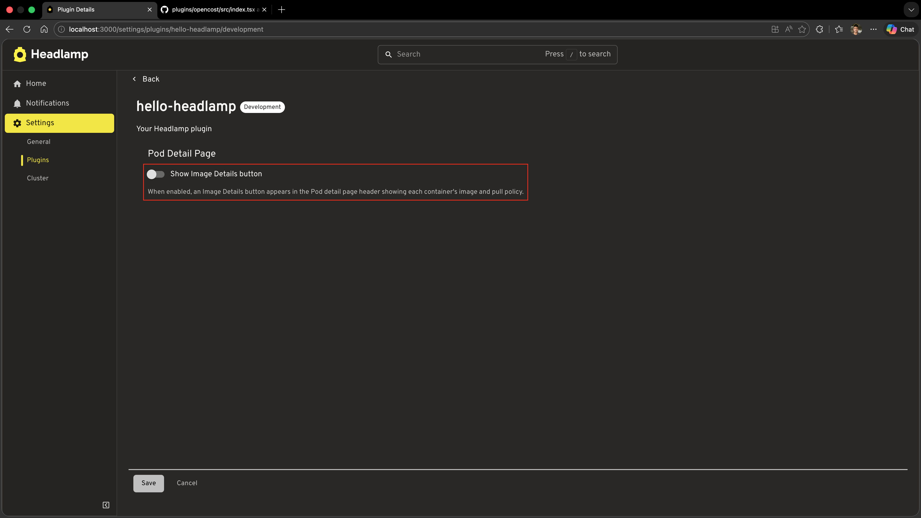
<Typography variant="body2" color="text.secondary" sx={{ mt: 1 }}>
When enabled, an Image Details button appears in the Pod detail page header
showing each container's image and pull policy.
</Typography>
</Box>
);
}
How it works:
| What it does | |
|---|---|
data prop | Current saved config injected by Headlamp — undefined until the user has saved at least once |
{ ...DEFAULT_CONFIG, ...data } | Merges saved values with defaults so the toggle always has a defined value on first load |
onDataChange?.({ ... }) | Stages the updated config; Headlamp persists it when the user clicks Save |
Step 3 — Register the Settings Page
Now wire the settings component into Headlamp. Open src/index.tsx and add the import and registration call:
import {
  registerResourceTableColumnsProcessor,
  registerDetailsViewHeaderAction,
  registerDetailsViewSectionsProcessor,
  DefaultDetailsViewSection,
  registerPluginSettings,        // ← add
} from '@kinvolk/headlamp-plugin/lib';

import HelloHeadlampSettings from './settings';  // ← add
Then add the registration at the bottom of the file:
// Register the settings page for this plugin.
// The first argument must match the plugin name in package.json.
registerPluginSettings('hello-headlamp', HelloHeadlampSettings, true);
The third argument (displaySaveButton) controls how the component is rendered and who is responsible for saving:
| Value | How component is rendered | Who saves |
|---|---|---|
false | <Comp /> — no props injected | The plugin calls store.set() / store.update() directly |
true | <Comp data={…} onDataChange={…} /> | Headlamp — shows a Save button and persists config when clicked |
Because our settings component uses data/onDataChange and we want Headlamp to show a Save button, we pass true.
Test it
- Save both files
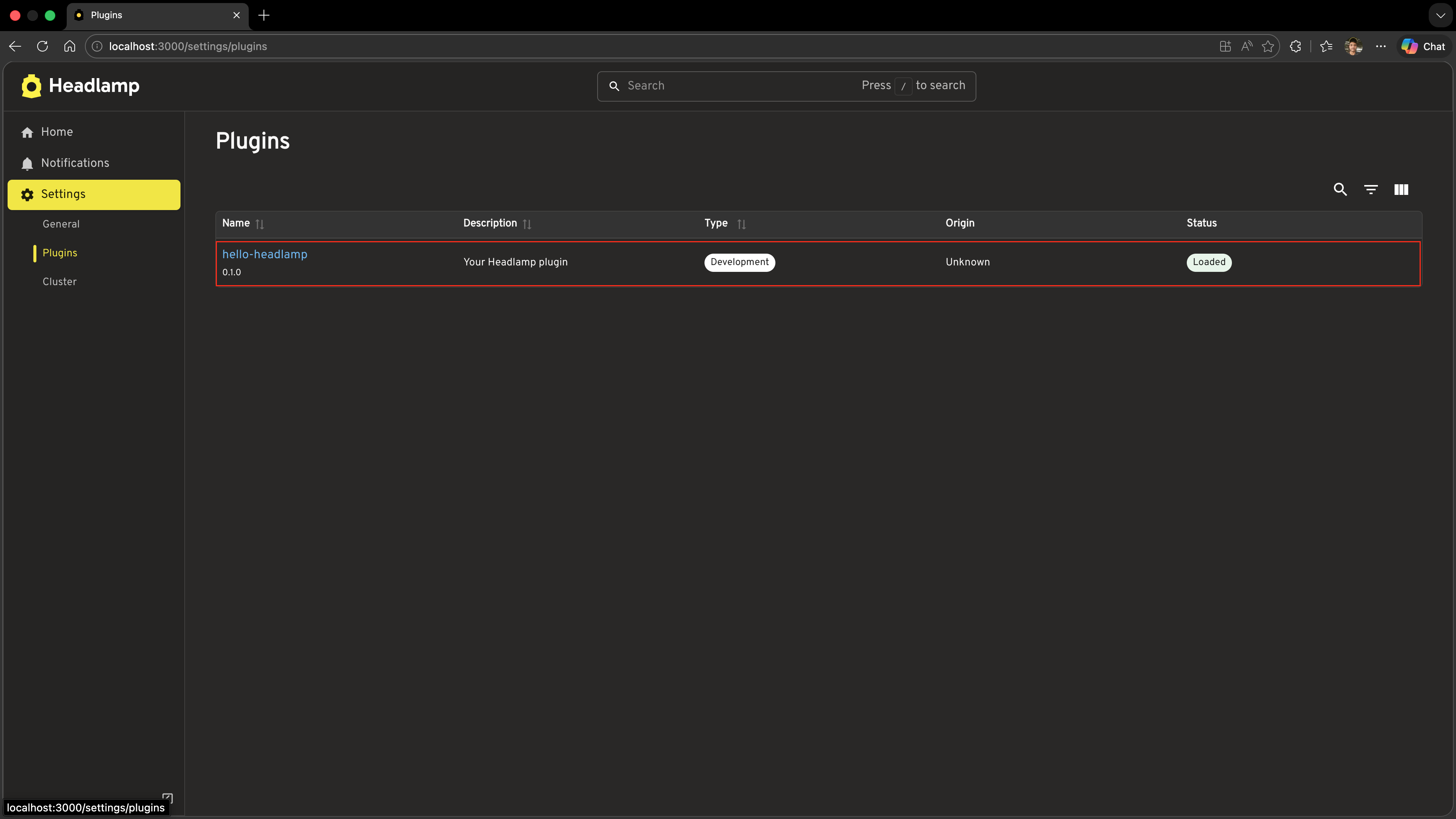
- In Headlamp, go to Settings (gear icon) → Plugins
- Find hello-headlamp in the list and click it
- You should see your settings page with the toggle switch
Step 4 — Make the Button Respect the Setting
The ImageDetailsAction component from Tutorial 7 is always shown on every Pod detail page. Because it is a React component, we can add store.useConfig() directly inside it. The component will re-render and hide the button the instant the config changes — no navigation or page refresh required.
Open src/index.tsx and replace the ImageDetailsAction function from Tutorial 7 with this updated version:
import { store, DEFAULT_CONFIG } from './config';

function ImageDetailsAction({ item }: { item: any }) {
  const [open, setOpen] = useState(false);
  // useConfig() must be called before any early returns (React rules of hooks)
  const useConf = store.useConfig();
  const savedConfig = useConf();
  const config = { ...DEFAULT_CONFIG, ...savedConfig };

  // Only show this action on Pod detail pages
  if (!item || item.kind !== 'Pod') {
    return null;
  }

  if (!config.showImageDetails) {
    return null;
  }

  const containers: Array<{
    name: string;
    image: string;
    imagePullPolicy?: string;
  }> = item.spec?.containers || [];

  return (
    <>
      <ActionButton
        description="Image Details"
        icon="mdi:image-search-outline"
        onClick={() => setOpen(true)}
      />
      <Dialog open={open} onClose={() => setOpen(false)} maxWidth="md" fullWidth>
        <DialogTitle>Container Images — {item.metadata?.name}</DialogTitle>
        <DialogContent>
          <SimpleTable
            data={containers}
            columns={[
              { label: 'Container', getter: c => c.name },
              { label: 'Image', getter: c => c.image },
              {
                label: 'Pull Policy',
                getter: c => c.imagePullPolicy || 'IfNotPresent (default)',
              },
            ]}
          />
        </DialogContent>
        <DialogActions>
          <Button onClick={() => setOpen(false)}>Close</Button>
        </DialogActions>
      </Dialog>
    </>
  );
}
The two additions compared to Tutorial 7:
store.useConfig()is called at the top of the function — before any early returns — to follow React's rules of hooks- The config check (
if (!config.showImageDetails) return null) hides the button when the setting is off
Because useConfig() is a reactive subscription, flipping the toggle in settings causes every mounted ImageDetailsAction instance to re-render immediately.
Test it
- Save the file
- Go to Settings → Plugins → hello-headlamp, flip the toggle off, and click Save
- Navigate to any Pod detail page — the Image Details button should no longer appear in the header
- Go back to settings, flip the toggle on, and click Save
- Switch back to the Pod detail page — the Image Details button reappears immediately, without a page refresh

Understanding ConfigStore
ConfigStore<T> is a generic class. The type parameter T is the shape of your config object, which gives you type safety when reading and writing config values.
import { ConfigStore } from '@kinvolk/headlamp-plugin/lib';

interface MyConfig {
  featureEnabled: boolean;
  itemsPerPage: number;
}

const store = new ConfigStore<MyConfig>('my-plugin-name');
The config key passed to the constructor must be unique across all plugins. Using your plugin's npm package name (e.g. 'hello-headlamp') is a safe convention.
Reading config
// Outside React — reads the current value synchronously
const config = store.get();   // returns MyConfig | undefined on first load

// Inside a React component — subscribes to changes
function MyComponent() {
  const useConf = store.useConfig();
  const config = useConf();   // re-renders when config changes
  // ...
}
Always apply defaults when reading, because store.get() returns undefined until the user visits the settings page for the first time:
const config = { featureEnabled: true, itemsPerPage: 20, ...store.get() };
Writing config
// Replace the entire config object
store.set({ featureEnabled: true, itemsPerPage: 50 });

// Merge a partial update — other keys are preserved
store.update({ itemsPerPage: 50 });
set() and update() trigger a re-render in any component that subscribes via useConfig().
Where config is persisted
Config is persisted to the browser's local storage, so values survive page refreshes. Config is scoped to the current browser profile — it is not synced across users or clusters.
Understanding registerPluginSettings
registerPluginSettings tells Headlamp to render your settings component on the plugin's settings page:
registerPluginSettings(pluginName, SettingsComponent, displaySaveButton);
| Argument | Type | Description |
|---|---|---|
pluginName | string | Must match the name field in the plugin's package.json |
SettingsComponent | React.ComponentType | The component Headlamp renders for settings |
displaySaveButton | boolean | false — component rendered without props, plugin saves itself; true — Headlamp injects data/onDataChange and shows a Save button |
The displaySaveButton modes
displaySaveButton: false — plugin handles saving
Headlamp renders the component with no props: <Comp />. The plugin is responsible for reading config (via store.useConfig()) and writing it (via store.set() / store.update()). Suitable for auto-save patterns such as toggles.
import { store } from './config';

function Settings() {
  const useConf = store.useConfig();
  const savedConfig = useConf();
  const config = { myFlag: true, ...savedConfig };

  return (
    <Switch
      checked={config.myFlag}
      onChange={e => store.set({ ...config, myFlag: e.target.checked })}
    />
  );
}

registerPluginSettings('my-plugin', Settings, false);
displaySaveButton: true — Headlamp handles saving (used in this tutorial)
Headlamp renders the component as <Comp data={…} onDataChange={…} /> and shows a Save button. The component reads from data and calls onDataChange to stage changes; Headlamp persists them when the user clicks Save. Suitable for forms where the user should confirm before saving.
import { PluginSettingsDetailsProps } from '@kinvolk/headlamp-plugin/lib';

function Settings({ data, onDataChange }: PluginSettingsDetailsProps) {
  return (
    <TextField
      value={data?.apiEndpoint || ''}
      onChange={e => onDataChange?.({ ...data, apiEndpoint: e.target.value })}
    />
  );
}

registerPluginSettings('my-plugin', Settings, true);
Complete Example
Below is the full set of files for this tutorial. The code in src/index.tsx shown here is only the additions/changes — keep everything else from Tutorial 7 in place.
src/config.ts (new file)
import { ConfigStore } from '@kinvolk/headlamp-plugin/lib';

export interface HelloHeadlampConfig {
  showImageDetails: boolean;
}

export const DEFAULT_CONFIG: HelloHeadlampConfig = {
  showImageDetails: true,
};

export const store = new ConfigStore<HelloHeadlampConfig>('hello-headlamp');

export function getConfig(): HelloHeadlampConfig {
  return { ...DEFAULT_CONFIG, ...store.get() };
}
src/settings.tsx (new file)
import { FormControlLabel, Switch, Typography, Box } from '@mui/material';
import { PluginSettingsDetailsProps } from '@kinvolk/headlamp-plugin/lib';
import { DEFAULT_CONFIG } from './config';

export default function HelloHeadlampSettings({ data, onDataChange }: PluginSettingsDetailsProps) {
  const config = { ...DEFAULT_CONFIG, ...data };

  return (
    <Box sx={{ p: 3 }}>
      <Typography variant="h6" gutterBottom>
        Pod Detail Page
      </Typography>
      <FormControlLabel
        control={
          <Switch
            checked={config.showImageDetails}
            onChange={(event) =>
              onDataChange?.({ ...config, showImageDetails: event.target.checked })
            }
          />
        }
        label="Show Image Details button"
      />
      <Typography variant="body2" color="text.secondary" sx={{ mt: 1 }}>
        When enabled, an Image Details button appears in the Pod detail page header
        showing each container's image and pull policy.
      </Typography>
    </Box>
  );
}
Changes to src/index.tsx
Add these imports at the top:
import { registerPluginSettings } from '@kinvolk/headlamp-plugin/lib';
import { store, DEFAULT_CONFIG } from './config';
import HelloHeadlampSettings from './settings';
Replace the ImageDetailsAction function from Tutorial 7 with:
function ImageDetailsAction({ item }: { item: any }) {
  const [open, setOpen] = useState(false);
  const useConf = store.useConfig();
  const savedConfig = useConf();
  const config = { ...DEFAULT_CONFIG, ...savedConfig };

  if (!item || item.kind !== 'Pod') {
    return null;
  }

  if (!config.showImageDetails) {
    return null;
  }

  const containers: Array<{
    name: string;
    image: string;
    imagePullPolicy?: string;
  }> = item.spec?.containers || [];

  return (
    <>
      <ActionButton
        description="Image Details"
        icon="mdi:image-search-outline"
        onClick={() => setOpen(true)}
      />
      <Dialog open={open} onClose={() => setOpen(false)} maxWidth="md" fullWidth>
        <DialogTitle>Container Images — {item.metadata?.name}</DialogTitle>
        <DialogContent>
          <SimpleTable
            data={containers}
            columns={[
              { label: 'Container', getter: c => c.name },
              { label: 'Image', getter: c => c.image },
              {
                label: 'Pull Policy',
                getter: c => c.imagePullPolicy || 'IfNotPresent (default)',
              },
            ]}
          />
        </DialogContent>
        <DialogActions>
          <Button onClick={() => setOpen(false)}>Close</Button>
        </DialogActions>
      </Dialog>
    </>
  );
}

// ... keep registerResourceTableColumnsProcessor, registerDetailsViewSectionsProcessor from Tutorial 7 ...

registerPluginSettings('hello-headlamp', HelloHeadlampSettings, true);
Troubleshooting
Settings page is not appearing for my plugin
- Confirm the first argument to
registerPluginSettingsexactly matches thenamefield inpackage.json. The name is case-sensitive. - Make sure
registerPluginSettingsis called at module level (outside any component), so it runs when the plugin loads. - Reload the Headlamp page — newly registered settings sometimes require a full reload.
Toggle is always shown as "off" even after saving
- Check that
onDataChangeis being called when the toggle fires — add aconsole.loginside theonChangehandler to confirm. - Make sure the
nameargument toregisterPluginSettingsexactly matches the plugin'snamefield inpackage.json.
Button does not disappear after toggling
- Ensure
store.useConfig()anduseConf()are called at the top level ofImageDetailsAction, before any early returns — React hooks must not be called conditionally. - Check for typos in the config key (
'showImageDetails') — a mismatch between whatsettings.tsxwrites and whatImageDetailsActionreads means they never see the same value.
store.get() returns undefined on first load
- This is expected — the user has never set a value yet. Always apply defaults:
const config = { ...DEFAULT_CONFIG, ...store.get() };
What's Next
You've learned how to make your plugin configurable:
- ✅ Creating a typed
ConfigStorewith shared defaults insrc/config.ts - ✅ Building a settings UI with an explicit Save button using
registerPluginSettings - ✅ Reading config reactively with
store.useConfig()inside a React component - ✅ Applying defaults to handle first-load before the user visits settings
Coming up in Tutorial 9: Applying Custom Themes
- Registering a custom MUI theme for your plugin
- Supporting light and dark mode
- Overriding colour tokens and typography
Quick Reference
ConfigStore
import { ConfigStore } from '@kinvolk/headlamp-plugin/lib';

// Create a typed store — key must be unique (use your plugin package name)
const store = new ConfigStore<MyConfig>('my-plugin');

// Write
store.set({ key: 'value' });          // Replace entire config
store.update({ key: 'value' });       // Merge partial update

// Read (outside React)
const config = store.get();           // undefined until first save

// Read (inside React component) — reactive
const useConf = store.useConfig();
const config = useConf();             // re-renders on change
registerPluginSettings
import { registerPluginSettings } from '@kinvolk/headlamp-plugin/lib';

// Self-managed saving (auto-save pattern)
registerPluginSettings('my-plugin', MySettingsComponent, false);

// Headlamp-managed saving (explicit Save button)
registerPluginSettings('my-plugin', MySettingsComponent, true);
PluginSettingsDetailsProps (for displaySaveButton: true)
import { PluginSettingsDetailsProps } from '@kinvolk/headlamp-plugin/lib';

function MySettings({ data, onDataChange }: PluginSettingsDetailsProps) {
  return (
    <input
      value={data?.myKey || ''}
      onChange={e => onDataChange?.({ myKey: e.target.value })}
    />
  );
}
Suggested src/config.ts structure
import { ConfigStore } from '@kinvolk/headlamp-plugin/lib';

export interface MyPluginConfig {
  featureEnabled: boolean;
  // ... add more settings here
}

export const DEFAULT_CONFIG: MyPluginConfig = { featureEnabled: true };

export const store = new ConfigStore<MyPluginConfig>('my-plugin');

export function getConfig(): MyPluginConfig {
  return { ...DEFAULT_CONFIG, ...store.get() };
}